

Freemium to Premium
Problem & Vision (Democratizing Loyalty)
The Context
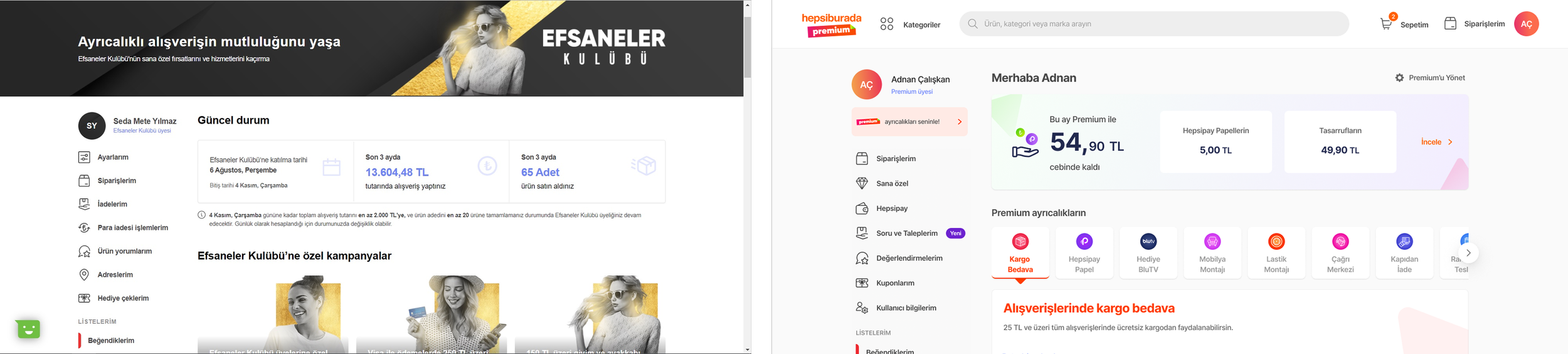
Previously, Hepsiburada used "The Legendaries Club," a loyalty program exclusive to high-frequency shoppers meeting strict purchase thresholds. While it served a niche group, it lacked the scalability to engage our broader user base of 12 million.
The Problem
The "exclusive" nature of the old system created a barrier to entry, leaving a vast majority of potential loyal users without a clear incentive to stay within the ecosystem. We needed to transition from an elite, transaction-based club to a scalable, value-driven membership model without losing the trust of our "as-is" loyal users.
The Vision
In early 2022, we initiated a strategic shift to Hepsiburada Premium—a more affordable, monthly membership system. Our vision was to democratize access to privileges and expand the visibility of benefits for a wider audience. By lowering the barrier to entry, we aimed to facilitate a smooth transition for existing members while aggressively acquiring new loyal users to drive sustainable business growth.
My Leadership & Role
As the lead of the design team, I orchestrated the end-to-end design process by collaborating closely with the research lead and their team during the problem definition, ideation, and validation stages. My focus was on:
Strategic Alignment: Bridging the gap between user experience and business objectives through regular stakeholder meetings and cross-functional workshops.
Product Strategy: Leading the creation of core hypotheses and shaping the product strategy to ensure design decisions were grounded in both user needs and business viability.
Team Structure
2 Product Designers, 2 User Researchers, 1 UX Writer
Date
Feb 2022 - Jul 2023
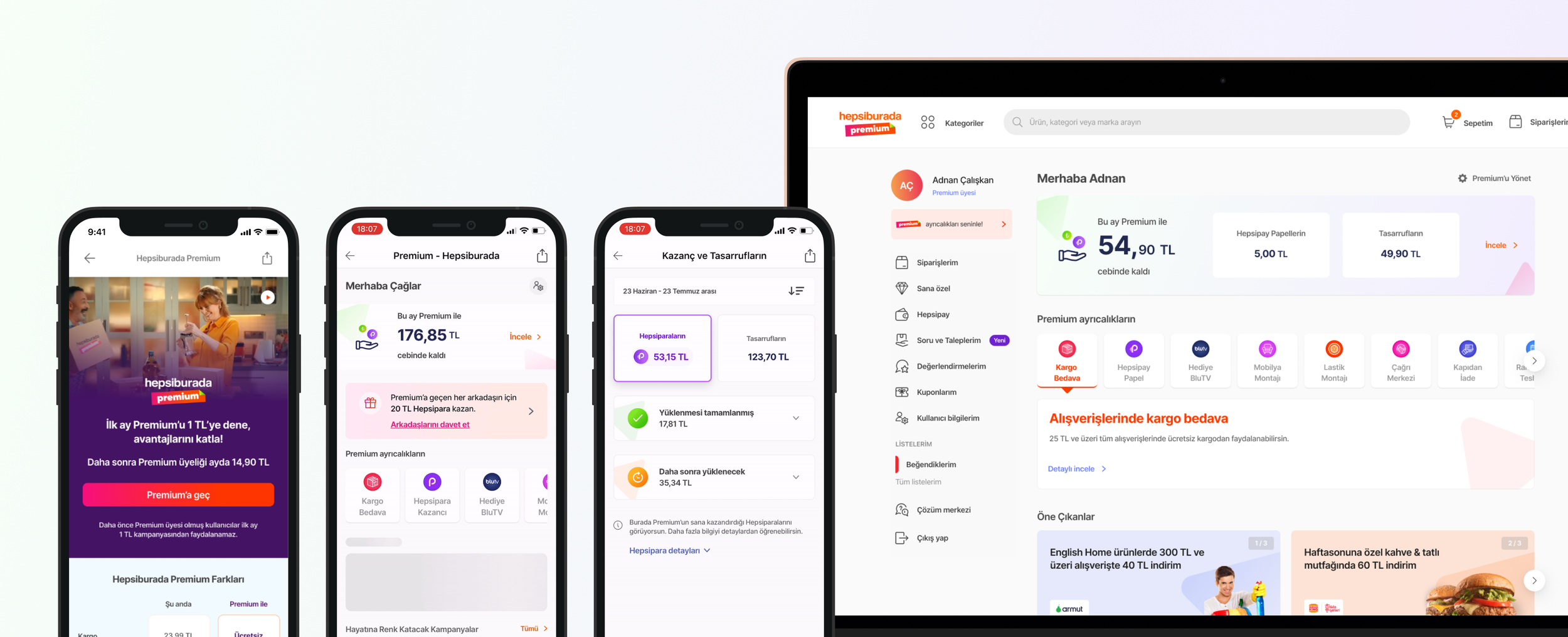
Former Design
Final Design
Strategic Business Goals
To measure the success of this transition, we focused on two primary pillars:
1. Increasing Customer Retention
We aimed to foster a stronger bond between the user and the product by rewarding loyalty and encouraging repeat purchases. The goal was to create a value proposition so compelling that it significantly reduced the likelihood that users would switch to competitors.
2. Driving Customer Engagement
By offering exclusive offers, personalized rewards, and interactive experiences, the program sought to foster active, ongoing engagement. Success was defined by increasing visit frequency, interaction depth, and overall purchase volume across the platform.
The Strategic Process: From Insights to Iteration
Literature Review: The Science of Loyalty
To build a sustainable membership model, we first looked into the core drivers of customer loyalty. Our research identified three critical pillars that shaped our design strategy.
Impact on Loyalty: Focusing on lowering the propensity for users to switch to competitors while driving repeat purchases.
Behavioral Influence: Engaging users through personalized rewards and exclusive offers to foster deeper interactions.
Trust Through Transparency: Building long-term brand trust by providing clear, honest communication about program benefits.
Benchmark Analysis: Global & Local Standards
We analyzed global giants (e.g., Amazon Prime, Walmart+, Tesco Clubcard) and digital leaders (e.g., Spotify, Instacart) to map out the "total user experience".

Key Insights for Hepsiburada Premium:
Landing Pages: Must include a clear value proposition, pricing, and a comparison table to aid decision-making.
Membership Hub: Needs to visualize "savings & financial benefits" to constantly remind users of the value they receive.
Off-boarding: A transparent cancellation process is vital to maintaining trust and gathering feedback for improvement.
Design Iterations & The RITE Method
We didn't just design; we validated. Using the RITE (Rapid Iterative Testing and Evaluation) technique, we continuously refined the experience based on real-time user feedback:
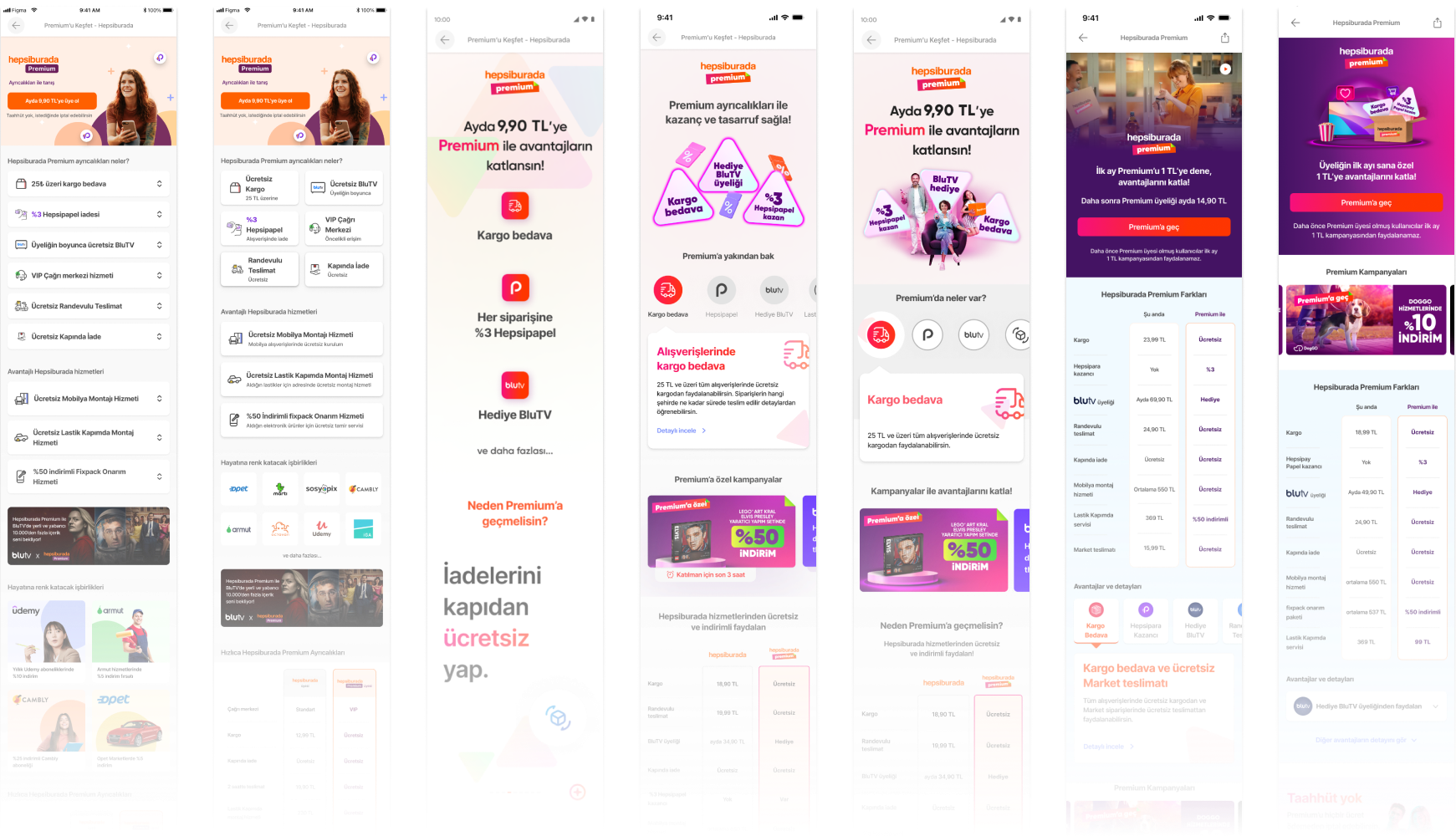
Optimizing the Hero: We experimented with various slogans and visual elements to improve the clarity of the subscription period and pricing, ensuring users understood the offer immediately.
Engagement Tactics: Recognizing that users scroll carefully to find value, we increased scroll depth and moved the Comparison Table higher for better visibility.
Transparency First: We removed the "Social Proof" field after research showed users found it unreliable and questioned its authenticity.
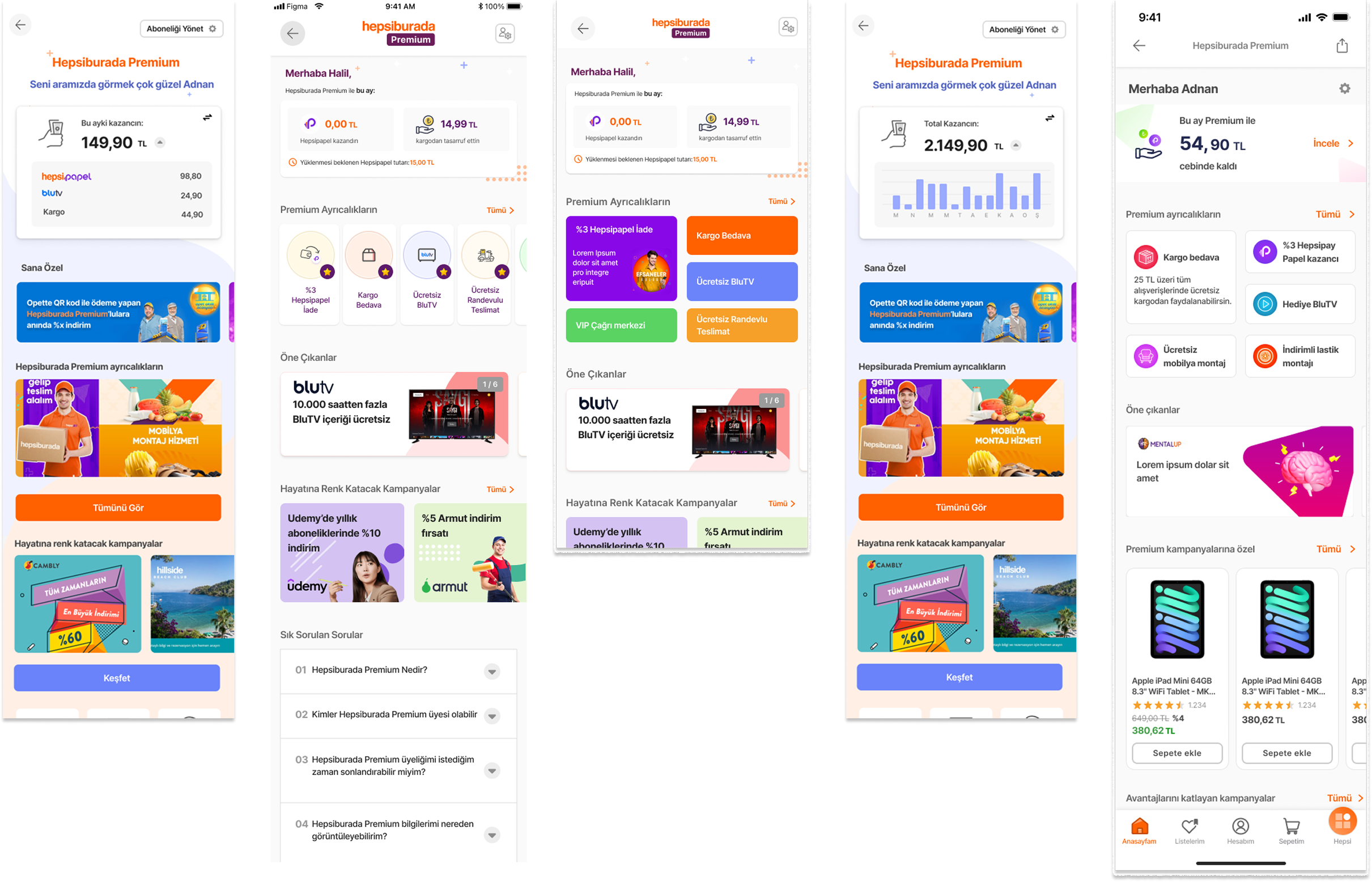
Granular Earnings & Savings: We finalized the "Earnings & Savings" area by adding detailed data for cashback and returns. This allows users to track their financial gains at a granular level, establishing a strong mental link between their shopping journey and their actual earnings.
Detailed Benefit Exploration: In response to user requests for greater transparency, we added detailed sections and a dedicated details page for each main benefit. This ensures that users can fully explore the scope of their privileges, such as partner campaigns and exclusive discounts, in an informed way.
Discoverable & Measurable Experience: The final form of the hub was designed to be a findable experience where users can easily navigate partnership campaigns and total savings. By making these elements highly visible and measurable, we ensure the membership remains relevant and valuable for the user every day.
Mapping the Freemium User Journey
To ensure a seamless transition to the Premium experience, we mapped out a comprehensive "Freemium User Buy Journey." The goal was to identify strategic "Touch-Points" where the Premium value proposition could be introduced without disrupting the user’s primary shopping flow.

Key Touch-Points Identified:
Discovery (Home & PDP): Implementing "Swimlane" and "Product Detail Page" touch-points to raise awareness early in the journey.
Conversion (Basket & Success): Utilizing "One-Click" entry points and landing page redirects at the moment of highest intent—checkout and post-purchase.
Retention (Account): Integrating a dedicated Premium Landing Page within the "My Account" section to ensure ongoing visibility for existing users.
This holistic approach ensured that whether a user was browsing or completing a purchase, the path to becoming a Premium User was always discoverable and intuitive.
Final Designs 🪄
Landing Page - Non-Loyal Users
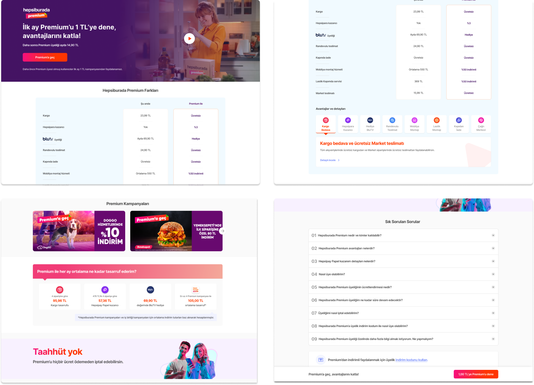
After multiple iterations and RITE testing, we finalized a landing page designed specifically for non-loyal users. The layout focuses on high conversion by prioritizing information that directly influences decision-making.
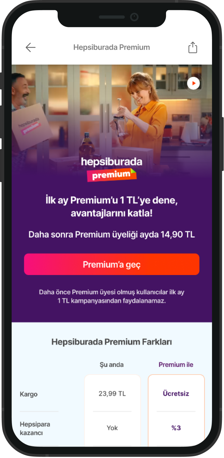
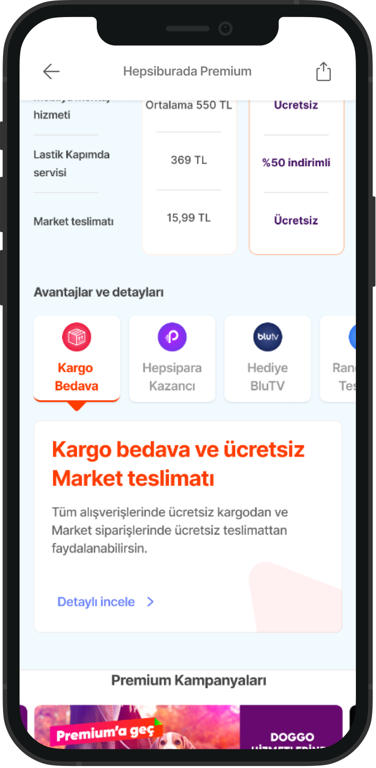
The Hero Experience: First Impressions Matter
The Hero banner is designed to welcome non-loyal users with immediate value.
Key Elements: A short promotional video, a clear trial fee, and regular membership information.
Design Intent: Since price is a vital factor in user decision-making, we placed subscription details at the forefront to ensure transparency.
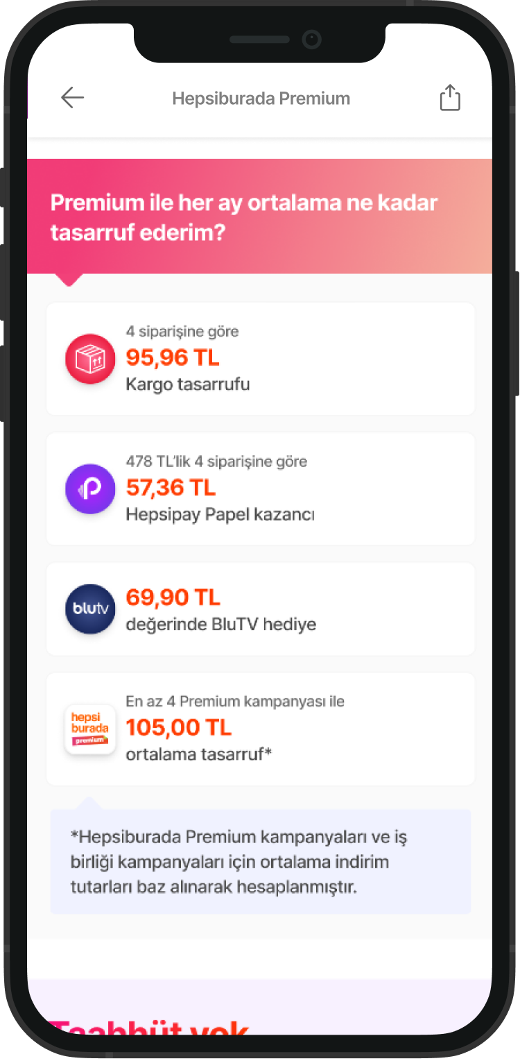
Savings as a Hook: We addressed the user’s core question—"How much do I save?"—by showcasing average monthly savings at a glance, providing a tangible financial incentive.
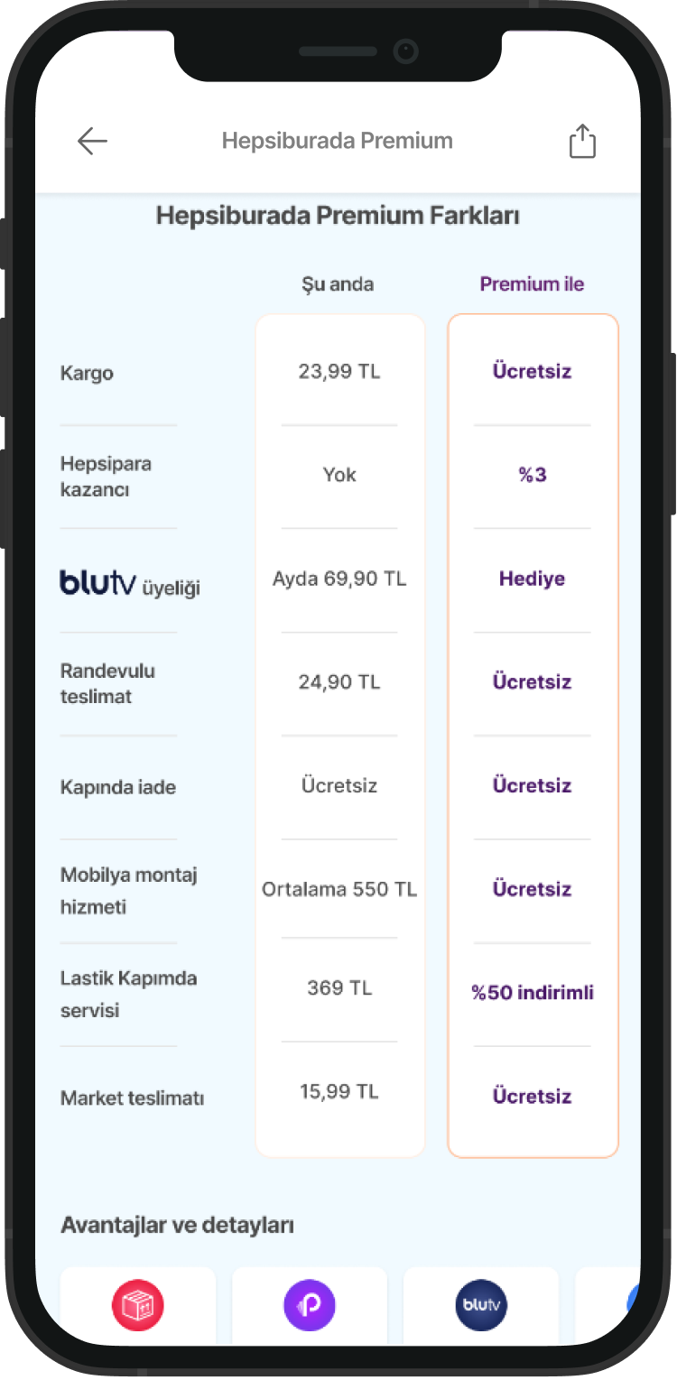
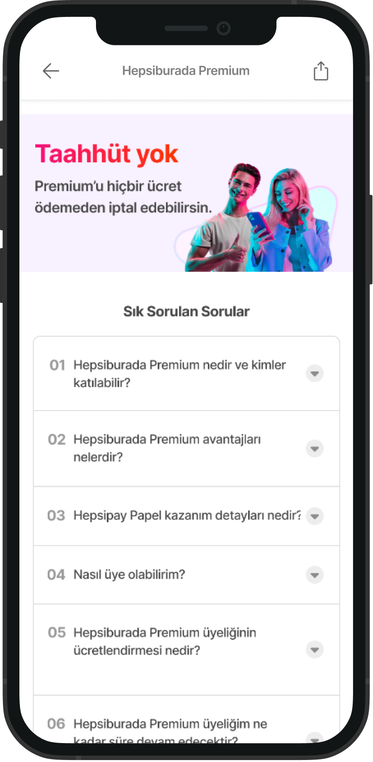
Anchoring with Evidence: Comparison & Savings
We utilized specific components to rationalize the purchase:
Comparison Table: This is a much-loved and highly researched feature that provides a clear "Freemium vs. Premium" comparison, effectively convincing users of the upgrade’s value.
Information Hierarchy & Trust
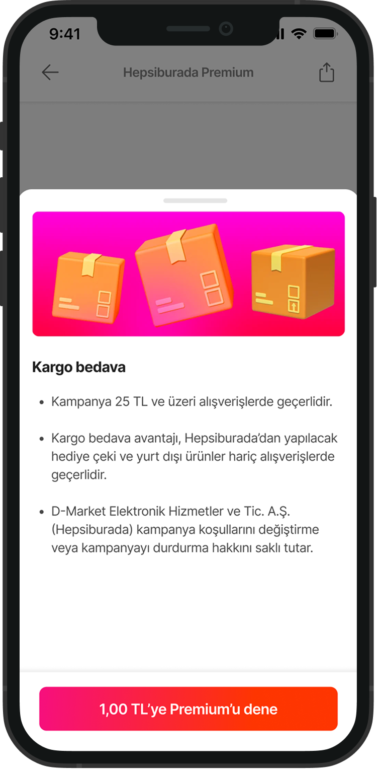
Benefits & Details: A dedicated component where users can access detailed information about every benefit. Users can join Premium instantly via the integrated CTA or explore deeper into the detail pages.
FAQ: We concluded the journey with an FAQ section to resolve general concerns and provide necessary legal information about the subscription.
Desktop Version
Final Solution: Premium Hub for Loyal Users
While the landing page's focus was acquisition, the Premium Hub was designed to drive long-term engagement and retention. For a loyal user, the hub serves as a personal dashboard that constantly validates the value of their subscription through transparent data and personalized benefits.
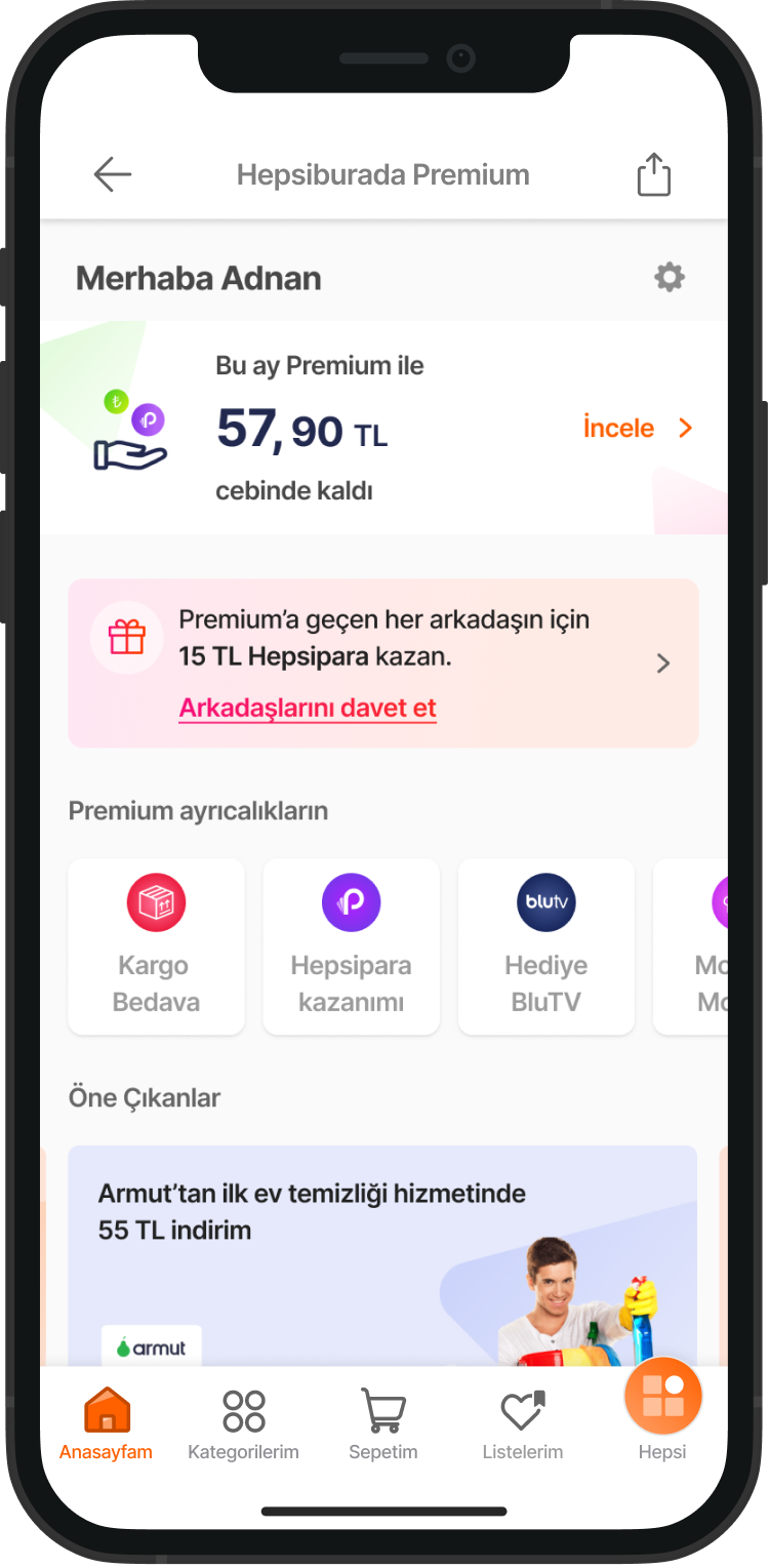
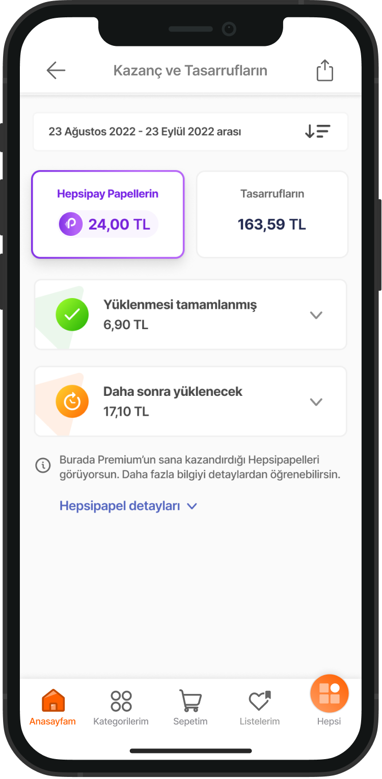
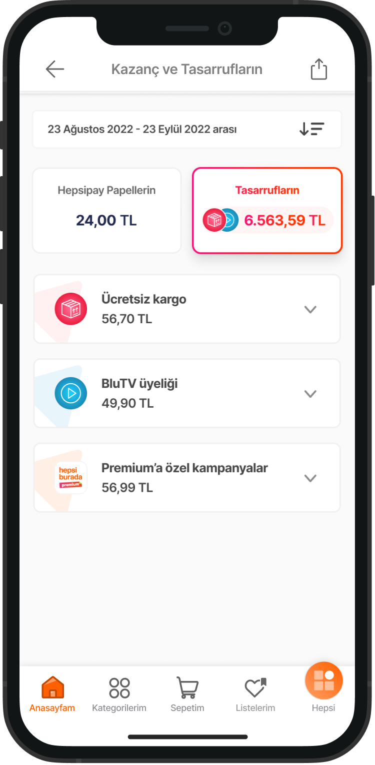
Visualizing Total Value: The main screen features a "Premium Savings" area that displays the user's total earnings and savings. This section provides direct evidence of the membership's financial benefits, helping users understand exactly how much they have gained since joining.
Social Growth Engine: We implemented a "Refer a Friend" program that turns our most loyal users into brand ambassadors, allowing them to earn instant rewards for every successful invitation.
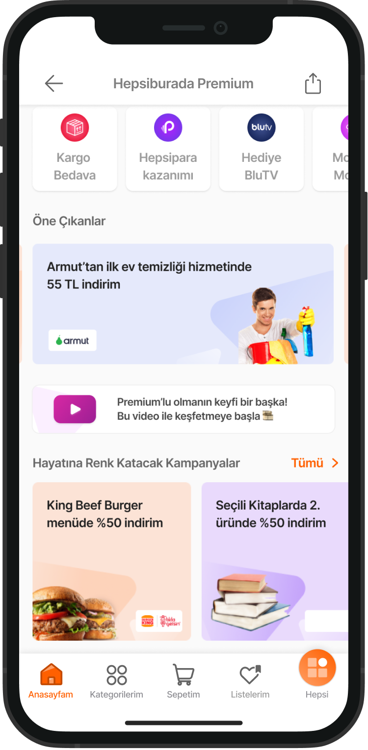
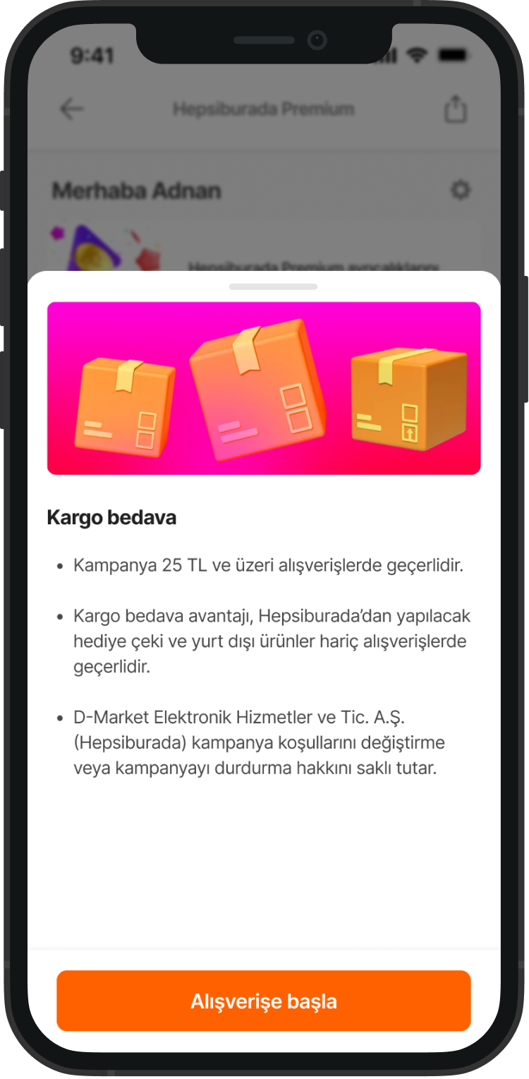
Benefit Discovery & Discovery: The hub includes a dedicated section for active benefits and partnership campaigns (e.g., BluTV or fuel discounts). This layout allows users to easily explore their privileges and manage their subscription details in one centralized location.
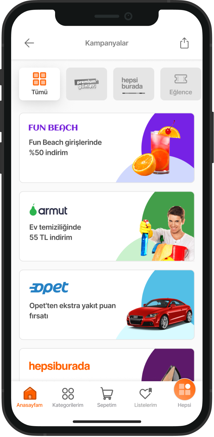
Campaigns & Promotions: In the main hub, users can easily explore active campaigns. We focused on creating a clear layout that lets users see partnership details (such as food, services, or fuel) and start shopping with one tap.
Impact
Engagement & Discovery: Campaigns and Promotions
To keep the membership valuable every day, we designed a dedicated discovery space. The goal here is to show users that Premium is not just about Hepsiburada, but a lifestyle ecosystem.
Value Reminder (The Win-Back Strategy)
Before finalizing the cancellation, we present a summary of the benefits the user currently enjoys. By highlighting what they will lose (e.g., free shipping, specific cashback rates), we aim to create a "re-evaluation" moment.
Strategic Exposure: Premium Touchpoints for Non-Members
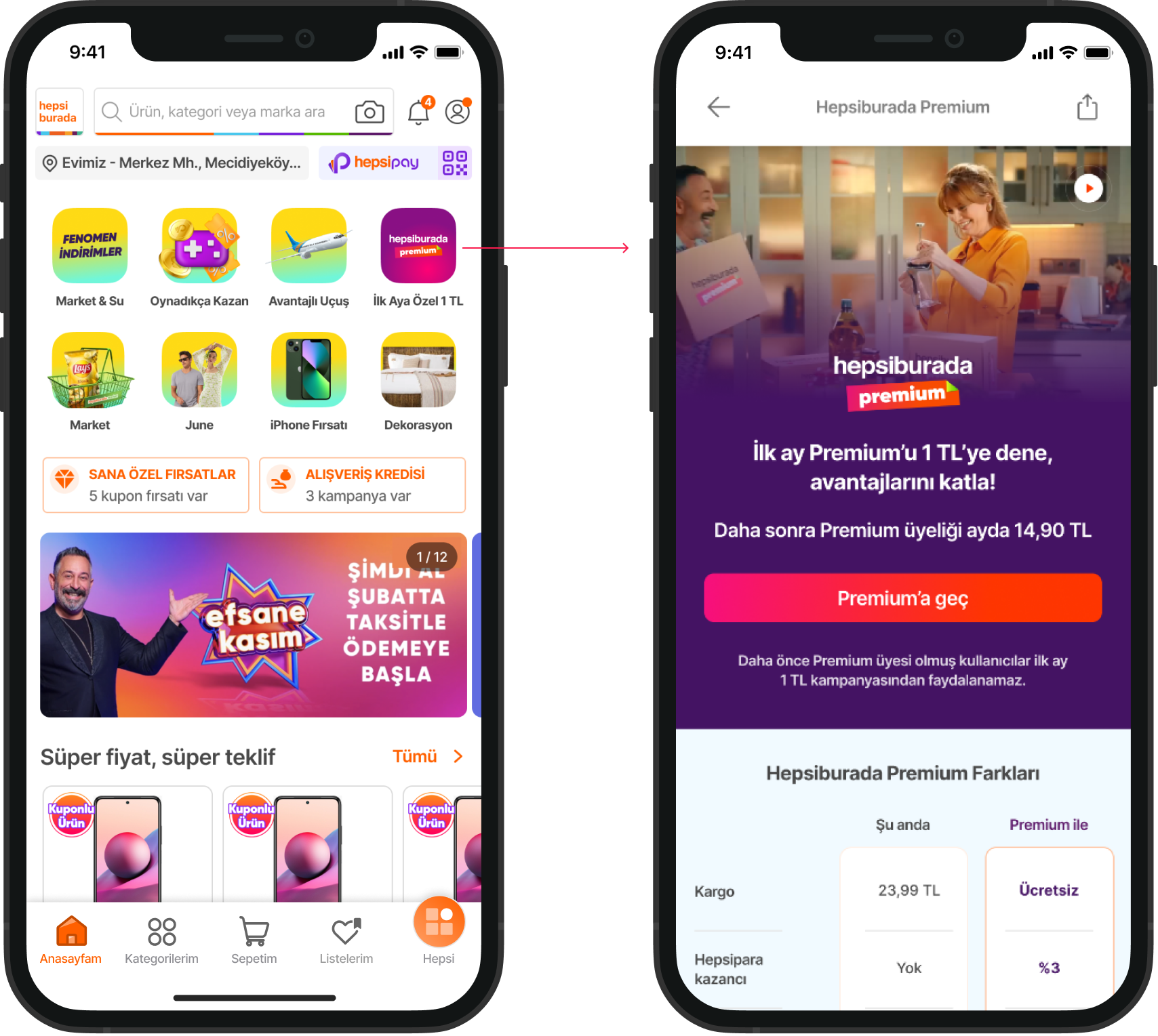
To convert regular users into Premium members, we strategically placed "Touchpoints" throughout the natural shopping journey. The goal was to make the Premium offer visible at the right moment without interrupting the user experience.
The Post-Purchase Experience: Premium Journey Touchpoints
Once a user becomes a Premium member, our goal shifts from acquisition to value validation. We integrated specific touchpoints across the journey to constantly remind users of the benefits they are receiving, ensuring long-term retention.
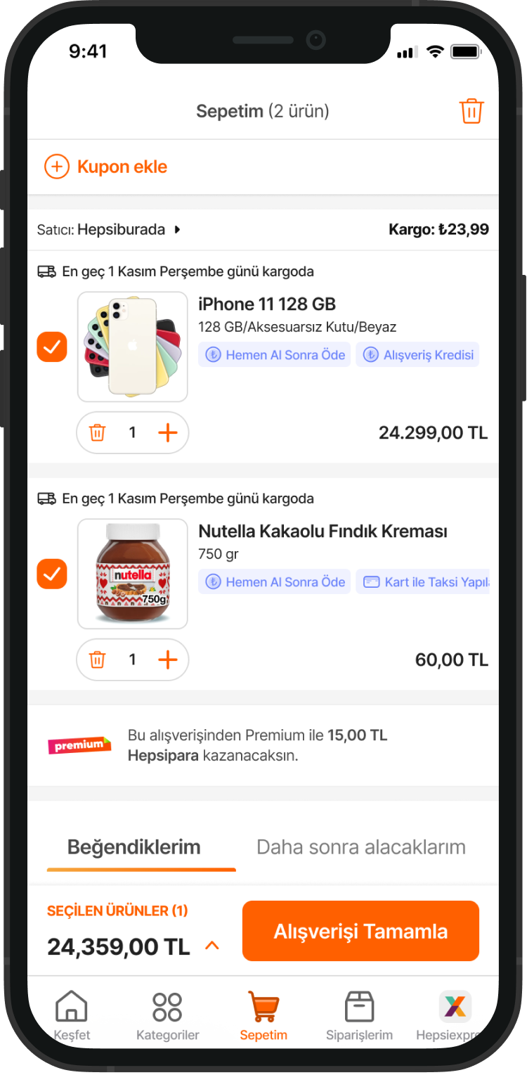
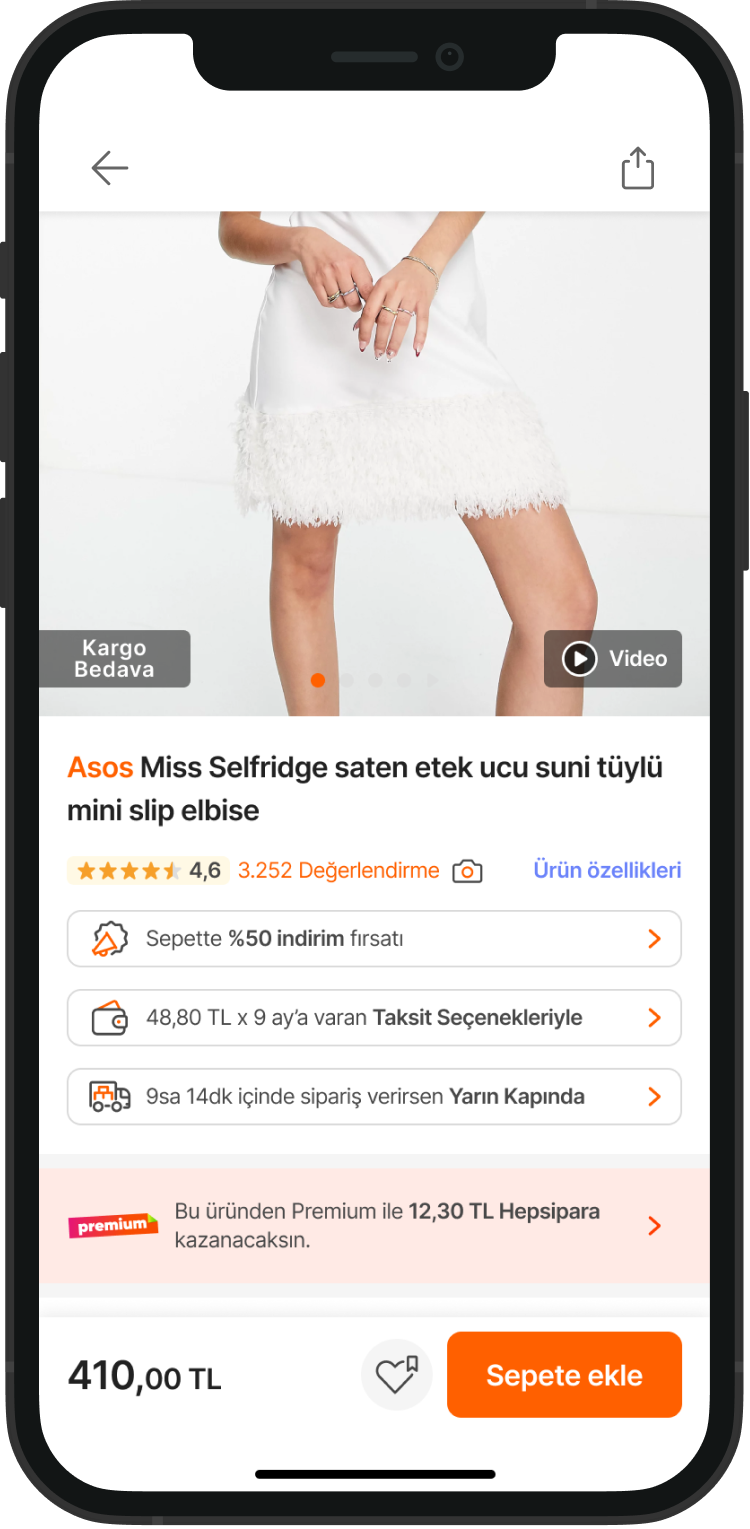
Shopping with Confidence (PDP): On the Product Detail Page, Premium users see a dedicated touchpoint that highlights their exclusive benefits, such as Free Shipping or Extra Cashback for that item. This reinforces the feeling of "smart shopping" at every step.
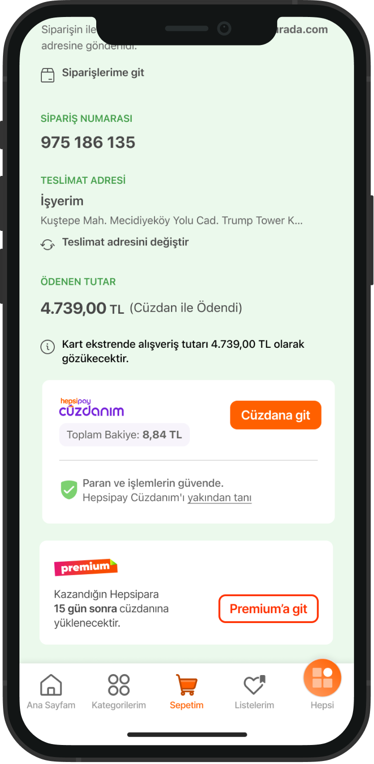
The Reward Cycle (Basket & Success):
In the Basket, we show the exact cashback amount the user will earn from the current transaction.
Feedback Collection: We implemented a simple survey to understand the reason for cancellation. This data is vital for our product team to improve the service and address common pain points.
1M Premium Users
Reached in 9 months
%35
Avg. Daily Visitors Share of Premium Users
%40
*Net Merchandise Value comes from Premıum users
4.3
AVG. Frequency of a Premıum User
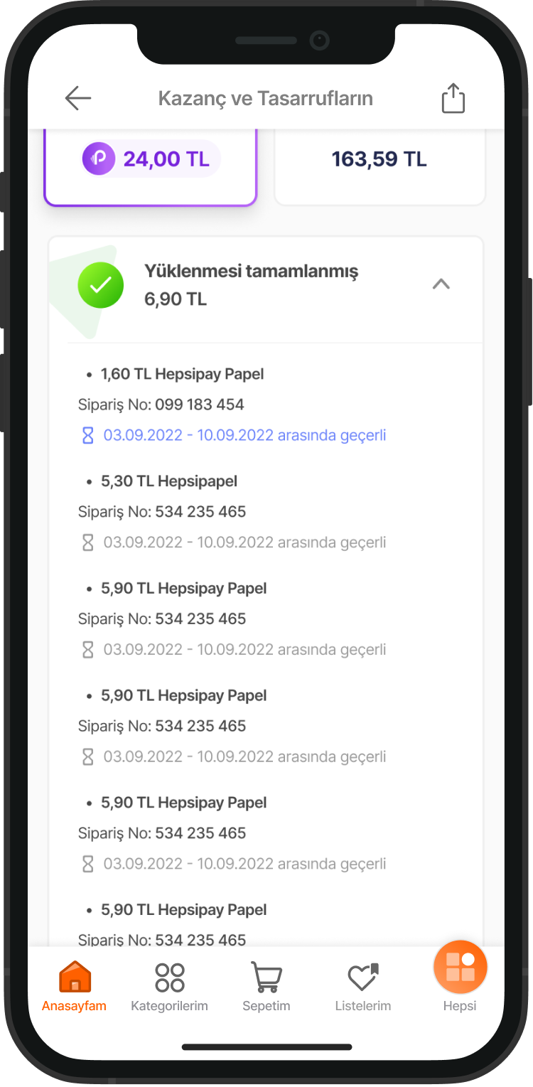
Detailed Earnings History: Users can access an "Earnings Detail" page to track their cashback history from various sources, such as Marketplace, Hepsiburada Market, and Travel. This transparency helps build long-term trust by showing exactly when and where each reward was earned.
Savings Tracking Feature
Designed a clear system for users to see and track their total savings through organized, easy-to-read views.
Clear Savings Breakdown: Created separate sections for different types of savings, such as subscription benefits (e.g., BluTV) and special campaign discounts.
Detailed History: Helped users review their past activity by showing dates, order numbers, and specific benefits used in one place.
View All Campaigns: We designed a secondary page listing all current and past offers. To make it more user-friendly, we added a category-based filtering system (e.g., Entertainment, Services) so users can quickly find what they need.
Continuous Value: By highlighting these external partnerships, we aim to increase app visit frequency and strengthen users' connection to the brand.
Home Page Awareness
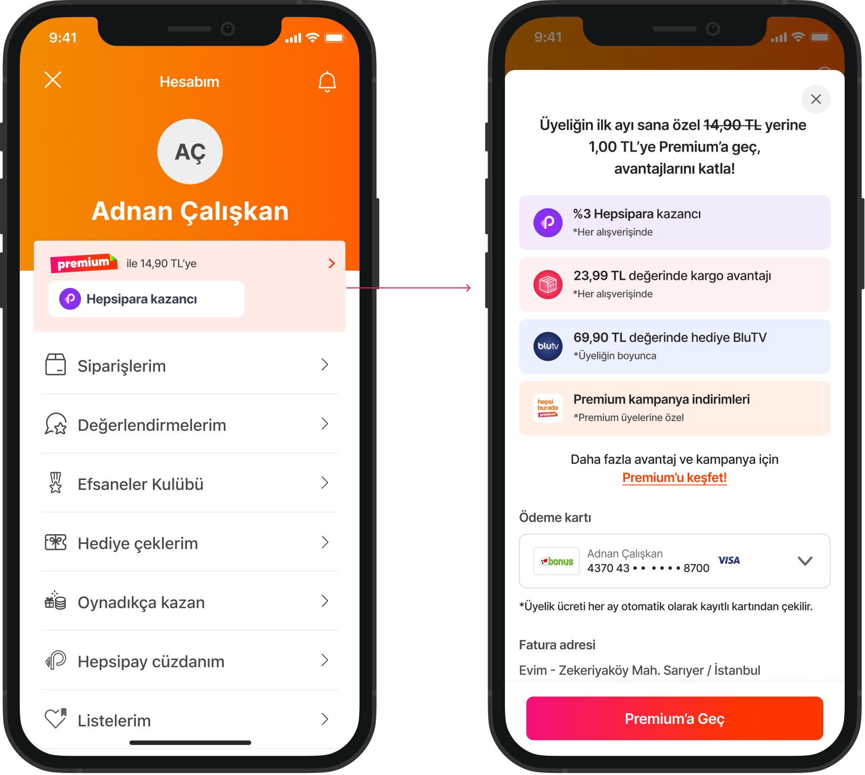
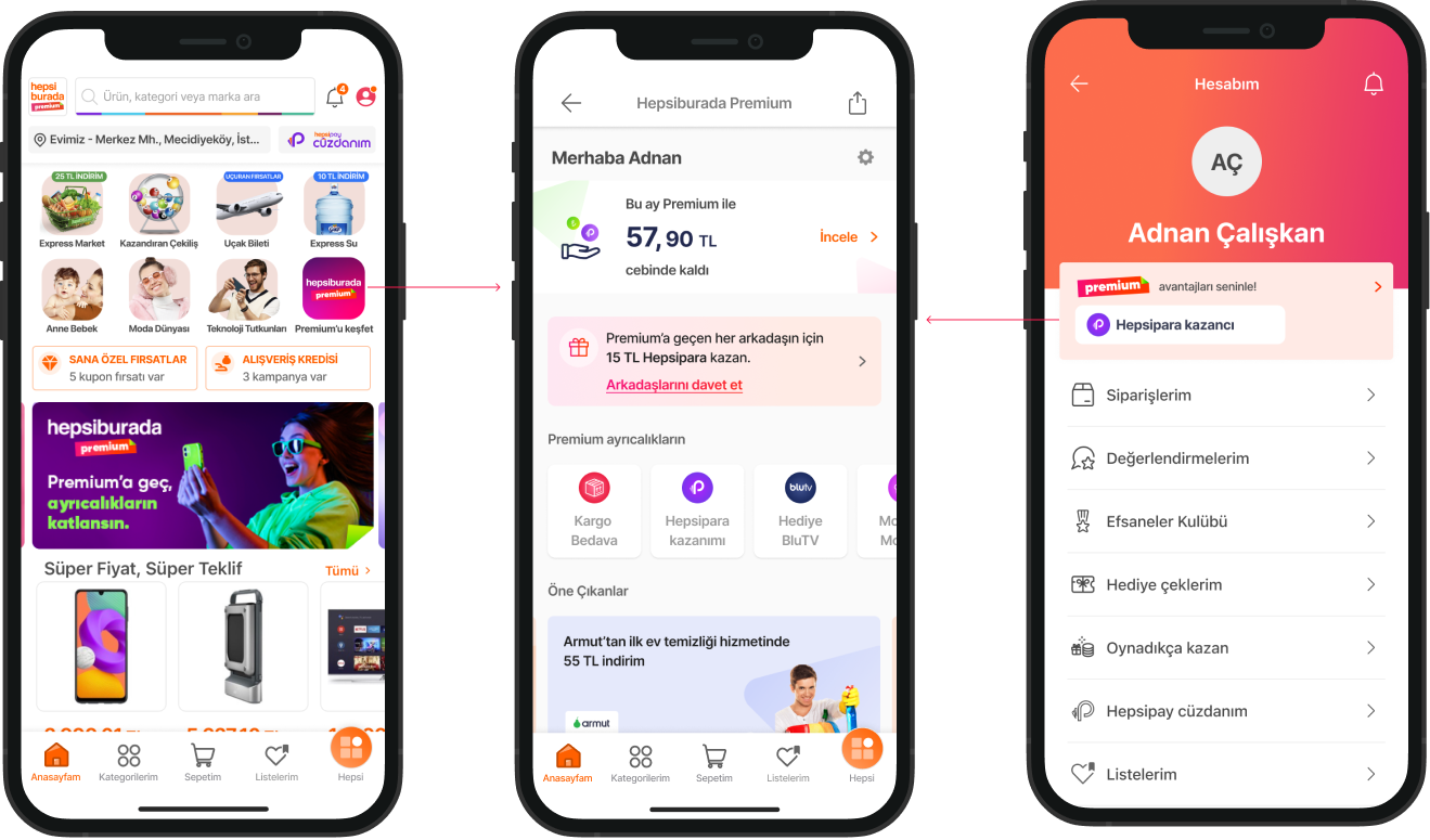
On the Hepsiburada home page, users see a dedicated Premium touchpoint in the "swim-lane" area. This banner offers a "1 TL for the first month" promotion, which immediately directs users to the Landing Page to explore all benefits.
Contextual Account Entry
On the My Account page, we added an animated touchpoint. This element informs users about the monthly subscription price and highlights the four main benefits in a compact way.
One-Click Fulfillment For users who interact with the animated touchpoint, we designed a "One-Click Fulfillment" screen. This allows users to become Premium members with just a single tap, removing all friction from the subscription process.
Direct Access via Home Page
To keep membership top of mind, we added a touchpoint to the Home Page. This allows users to jump directly into their Savings & Earnings dashboard with one tap, making it easy to see the ongoing value they receive from the program.
Dynamic Summary via My Account:
On the My Account page, we implemented a dynamic and animated touchpoint. Instead of specific personal data, this element highlights general Premium benefits to remind users of their privileges. It serves as a clear gateway, leading users directly to the Premium Hub where they can see their total savings and discover new partnership campaigns.
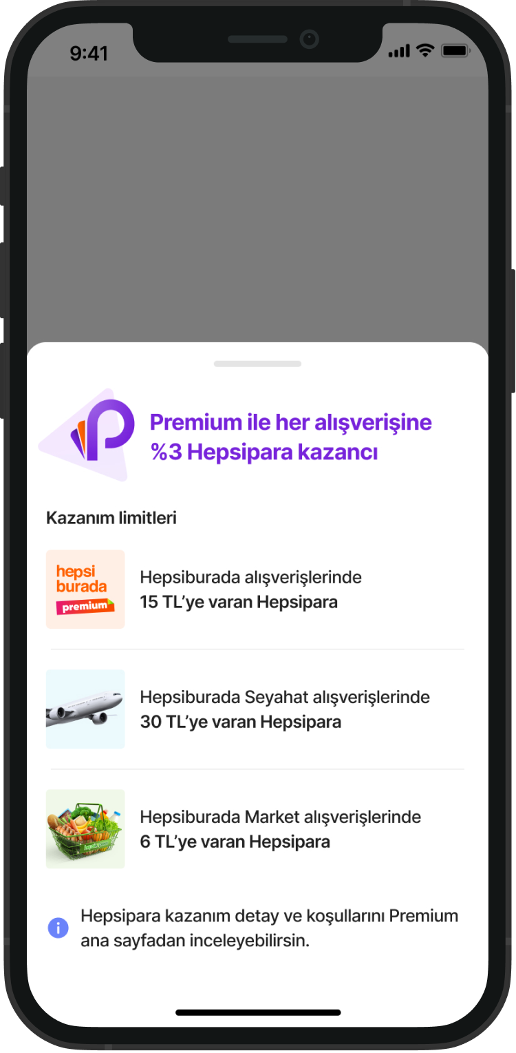
Vertical-Specific Insights: Users interacting with this touchpoint can view detailed cashback rates across various verticals, such as flight tickets and market orders. This helps them understand the broader value of their Premium membership beyond just the current item.
Post-Purchase Success: Upon a successful payment, the experience continues with a dedicated success notification.
At this stage, we inform the user about when their cashback will be credited to their account. To maintain engagement, we also provide a direct link to the Premium Hub, encouraging them to track their total earnings and explore other active benefits.
The Off-boarding Experience: Designing for Trust
Even when a user decides to leave, the experience should be transparent and respectful. We designed the cancellation flow not just as a "goodbye," but as an opportunity to remind the user of the value they might lose, while maintaining long-term brand trust.
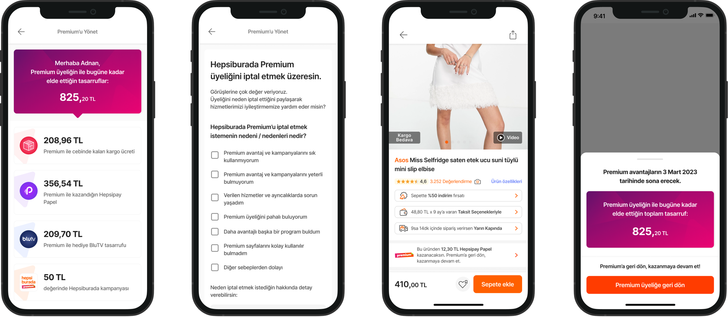
Contextual PDP Reminder:
On the Product Detail Page for users in the off-boarding flow, we placed a specific touchpoint. It informs the user: "If you return to Premium, you will earn cashback from this specific product." By connecting the membership directly to a purchase they are considering, we make the benefit tangible and immediate.
When a user interacts with the win-back touchpoint, we present a Persuasion Bottom Sheet instead of a standard confirmation. The goal is to trigger "loss aversion" by showing exactly what they are giving up.
%37
Avg. Daily Order Share of Premium Users
7.5 times higher
AVG. Frequency of Premium user Compare to Non-Premium users