

An Entertaining & Rewarding Game Hub
Designing a centralized game and rewards hub to improve discoverability, repeat visits, and order contribution inside an e-commerce super-app.
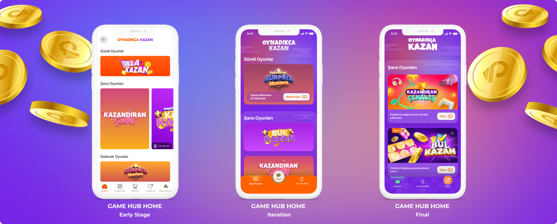
From a basic game listing to a branded Game Hub experience designed to improve discoverability, repeat visits, and reward-driven engagement.
Problem & Vision
Context
As part of Hepsiburada’s super-app strategy, Oynadıkça Kazan became the game and gamification vertical of the ecosystem, allowing users to play games and win rewards such as digital points, instant discounts, and category coupons. The game experience had the potential to create engagement beyond transactional shopping by making users return more frequently and interact with the platform in a more playful way.
Vision
We designed Game Hub as a centralized, branded destination where users could discover available games, understand what they could win, track rewards, and return regularly. The goal was to transform scattered game touchpoints into a scalable engagement layer that could drive traffic, increase order contribution, and grow a loyal gamer audience inside the Hepsiburada ecosystem.
My Leadership & Role
As the design lead, I led the Game Hub experience from early problem definition to concept, validation, and iteration. I partnered with research, product, development, and branding teams to transform scattered game touchpoints into a centralized destination that supported Hepsiburada’s super-app strategy.
Strategy: Aligning the experience with business goals around traffic, orders, and loyal gamer growth.
Product Direction: Shaping hypotheses around discoverability, repeat visits, rewards, and habit formation.
Design Leadership: Guiding the hub structure, touchpoints, game cards, profile, rewards, and future iterations.
Validation: Working with research to turn user feedback into clearer, more engaging game experiences.
Team Structure
2 Product Designers, 1 User Researcher, 1 UX Writer
Date
Mar 2022 - Jun 2022
Opportunity / Problem Evidence
Why Game Access Needed to Change
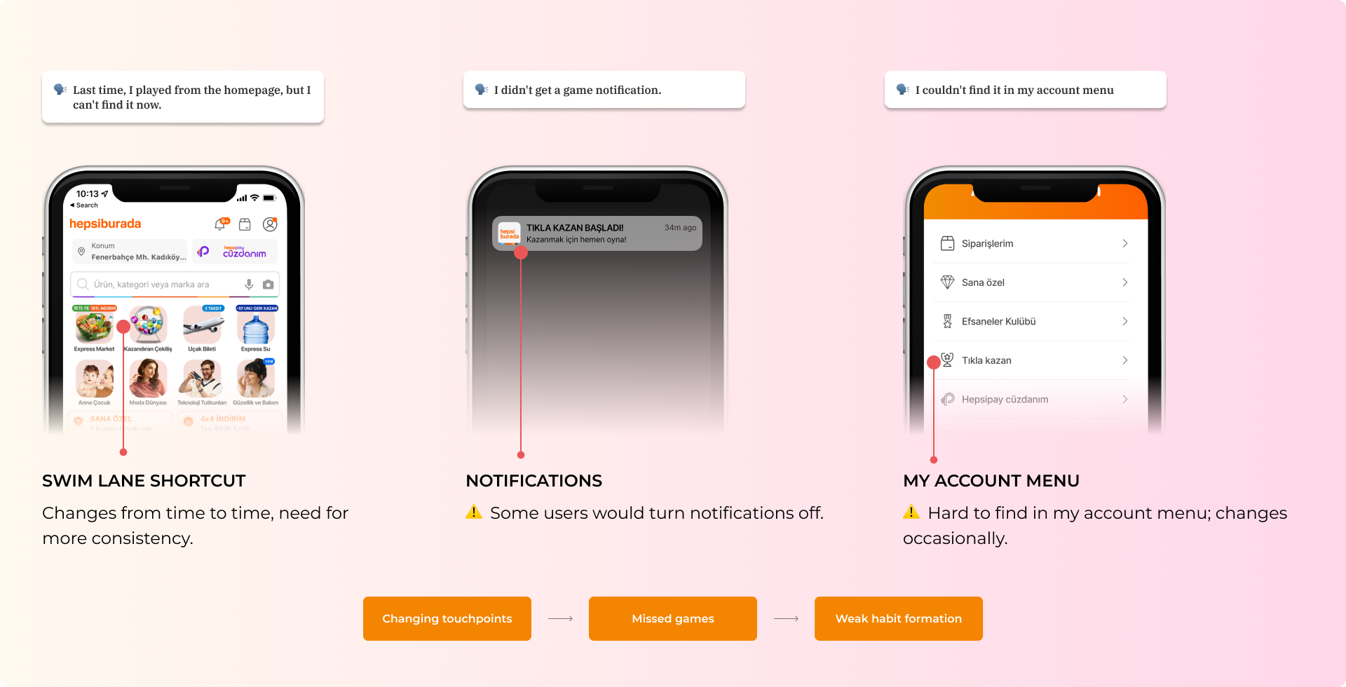
CX feedback revealed that users had difficulty finding games again, missed notifications, and were confused by changing access points. The issue was not only visual design; the experience lacked a consistent destination that could support discovery, timing, and repeat engagement.
Approach
From Fragmented Access to a Centralized Hub
Benchmarking
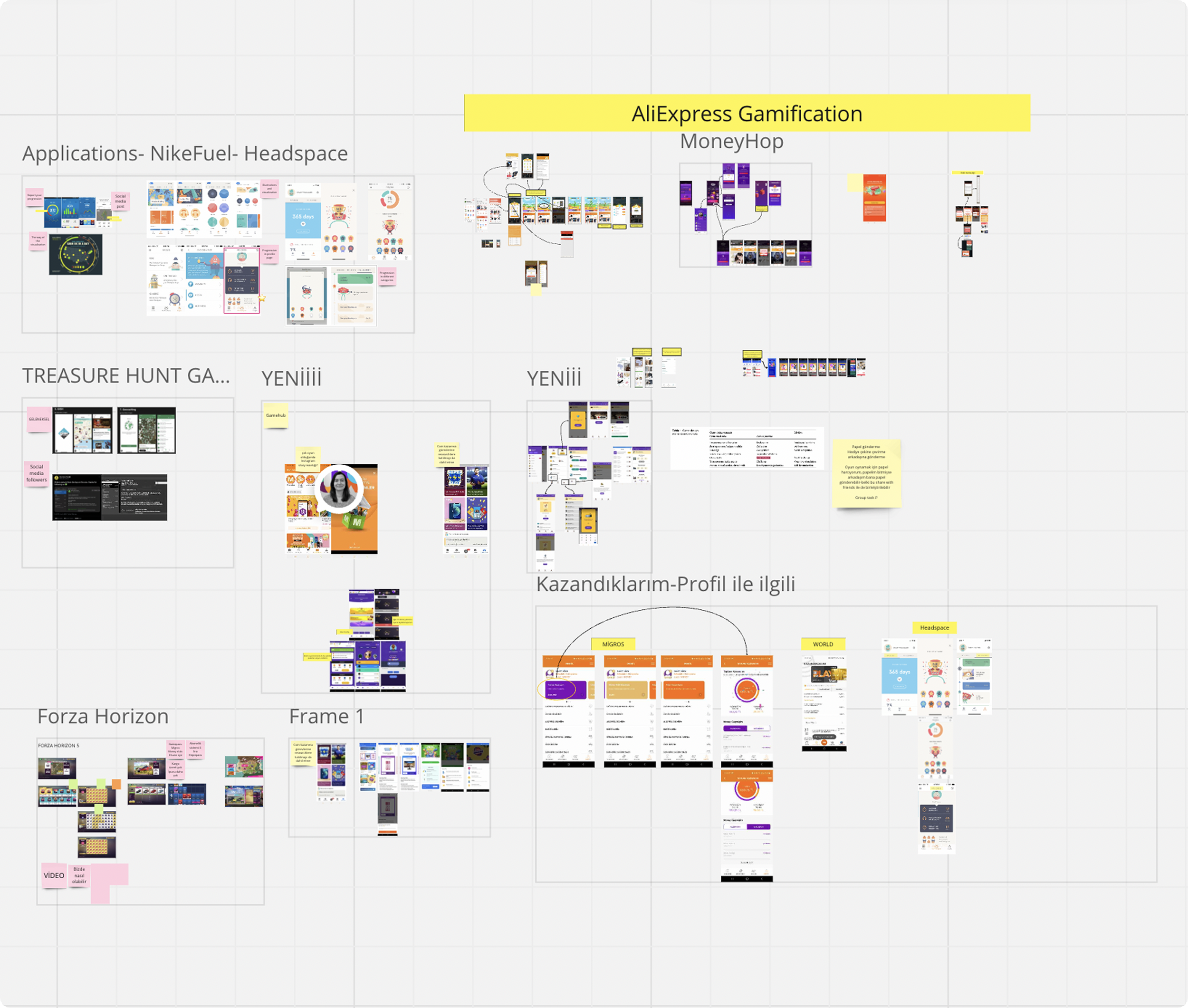
We benchmarked similar game hub and discovery experiences to understand how they structured content hierarchy, vertical identity, personalization, rewards, and paths back to shopping.
What we learned
Strong experiences did not only list content; they created a clear destination with recognizable branding, prioritized content, and visible user value.
Decision
We positioned Game Hub as a branded discovery destination, not just a list of games.
Design implications
Create a clear hierarchy for different game types
Build a distinct visual world for the game vertical
Make rewards and benefits visible early
Connect game participation back to shopping outcomes
From MVP to Reliable Access
First Touch
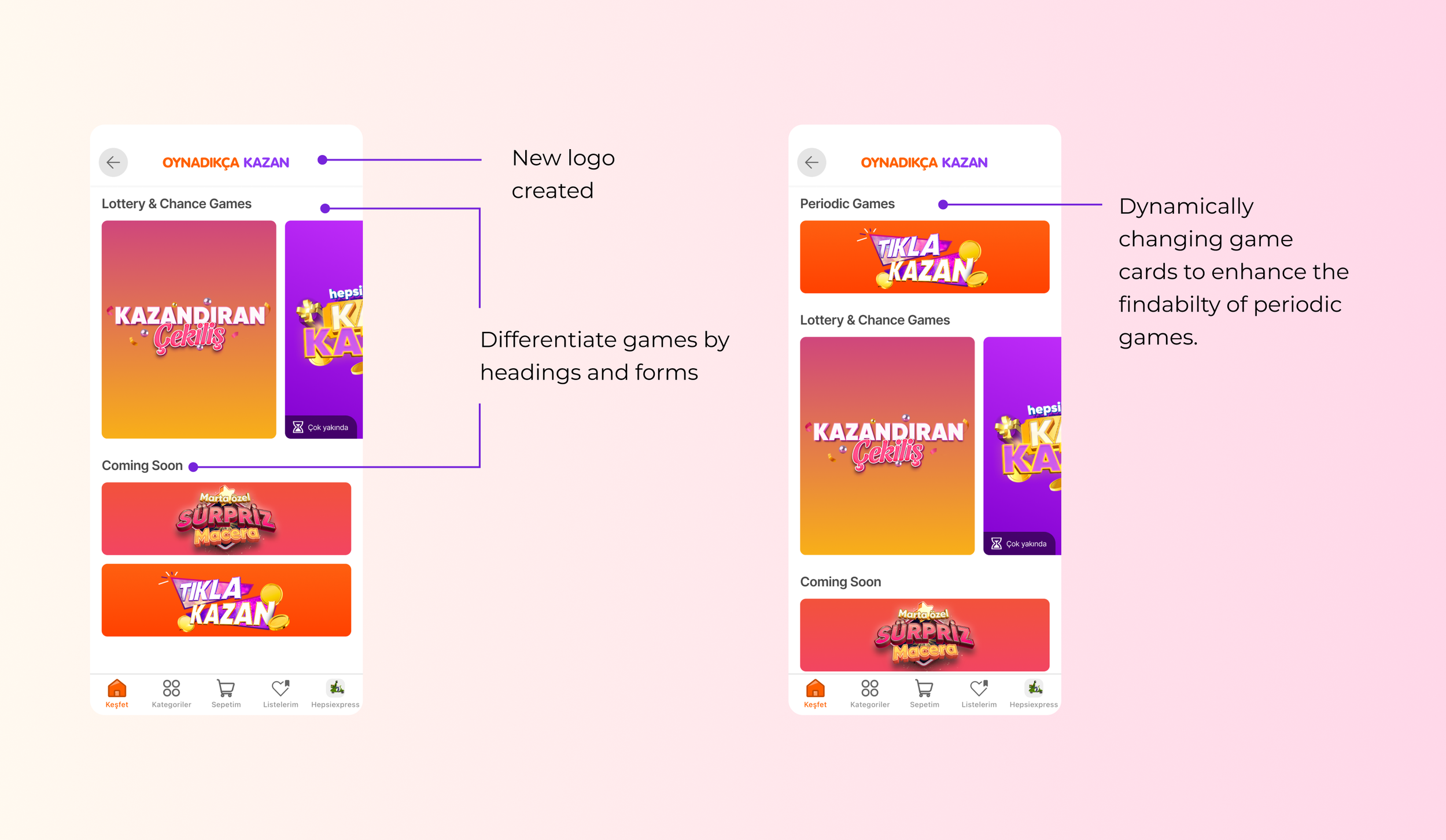
Learning: A centralized page improved findability, but the early version still felt close to a regular e-commerce listing page.
Decision: Keep the hub structure, while evolving the experience with stronger branding, clearer game categories, and dynamic cards for periodic games.
We first created a lightweight Game Hub MVP to bring available games into one place and validate whether centralization could improve discoverability. As the experience grew, we expanded access through more reliable touchpoints to support repeat visits and habit formation
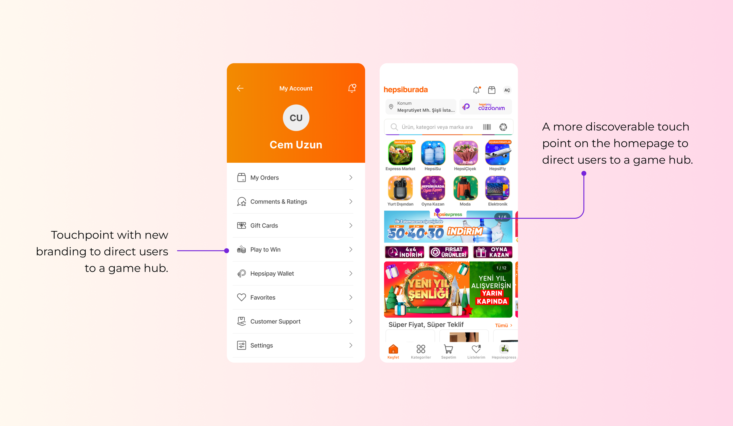
Adding Touchpoints
Learning: Users needed predictable ways to access games, especially when games were only live periodically.
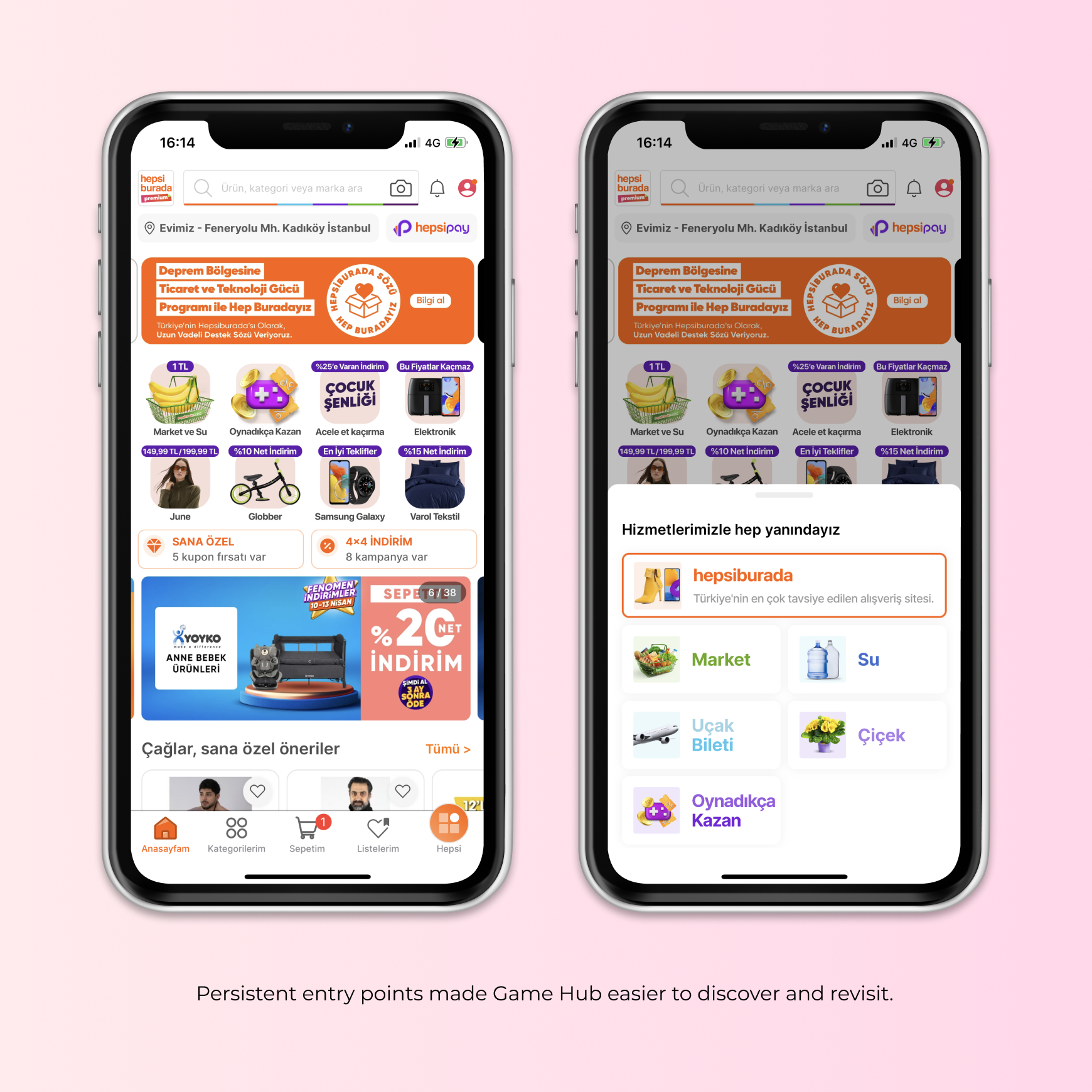
Decision: Add persistent entry points from the homepage and super-app navigation to make Game Hub easier to return to.
Strategy
We first created a lightweight Game Hub MVP to bring available games into one place and validate whether centralization could improve discoverability. As the experience grew, we expanded access through more reliable touchpoints to support repeat visits and habit formation
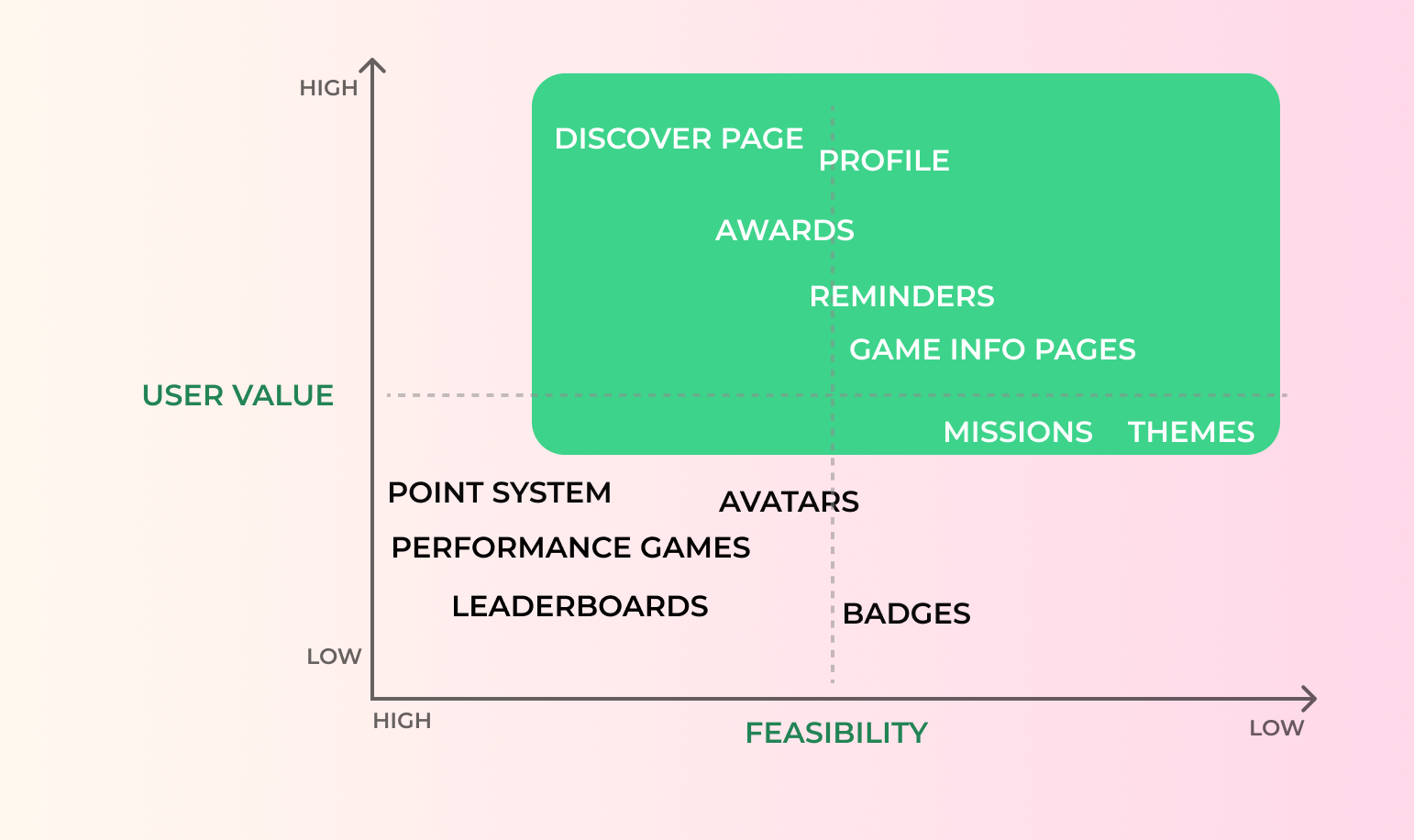
Focus Areas
Discoverability
Profiles
Rewards
Reminders
Shopping redirection
We used the prioritization matrix to focus on high-value, feasible foundations before investing in heavier gamification mechanics.
Validation & Iteration
Usability testing helped us move from a simple game listing toward a more engaging game destination. Users needed a more playful interface, clearer game cards, visible progress and rewards, and better communication around coming-soon games.
1. Playful Interface
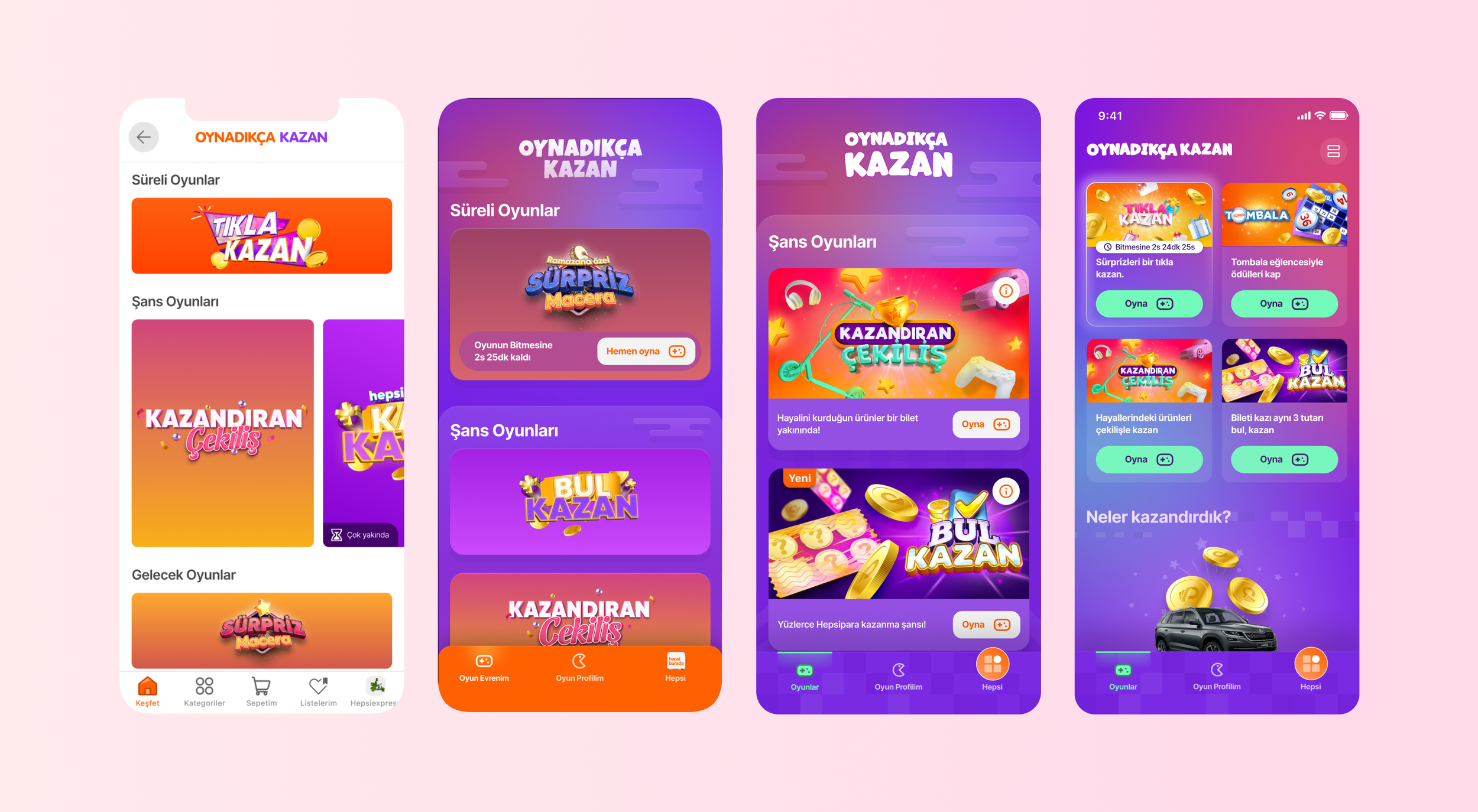
Insight: The first version felt too close to regular e-commerce.
Decision: Create a more branded, colorful, and entertainment-led Game Hub.
2. Game Card Clarity
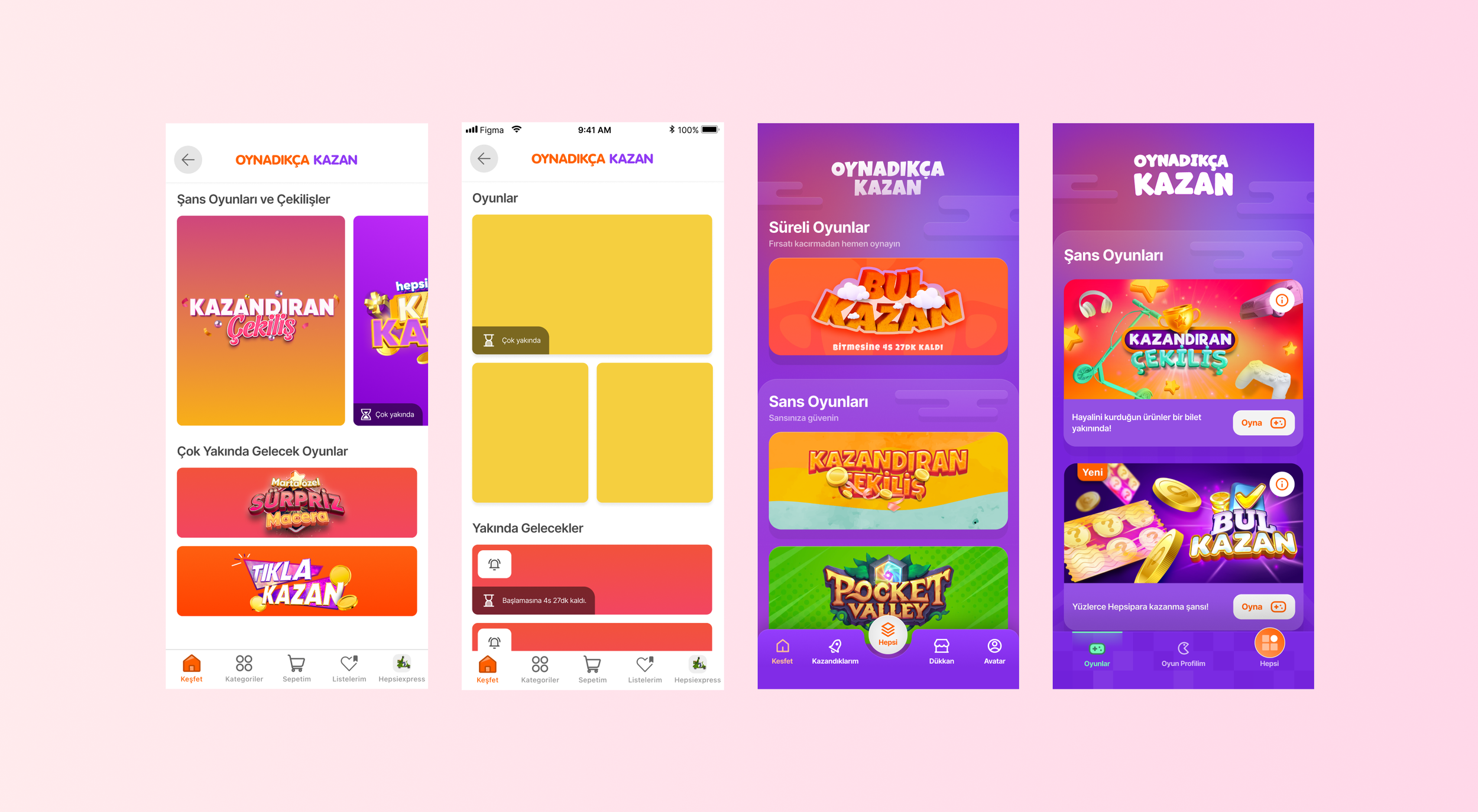
Insight: Users needed to quickly understand what each game was about and what they could win.
Decision: Redesign cards with stronger visuals, teaser messages, reward cues, and timing states.
3. Progress & Rewards
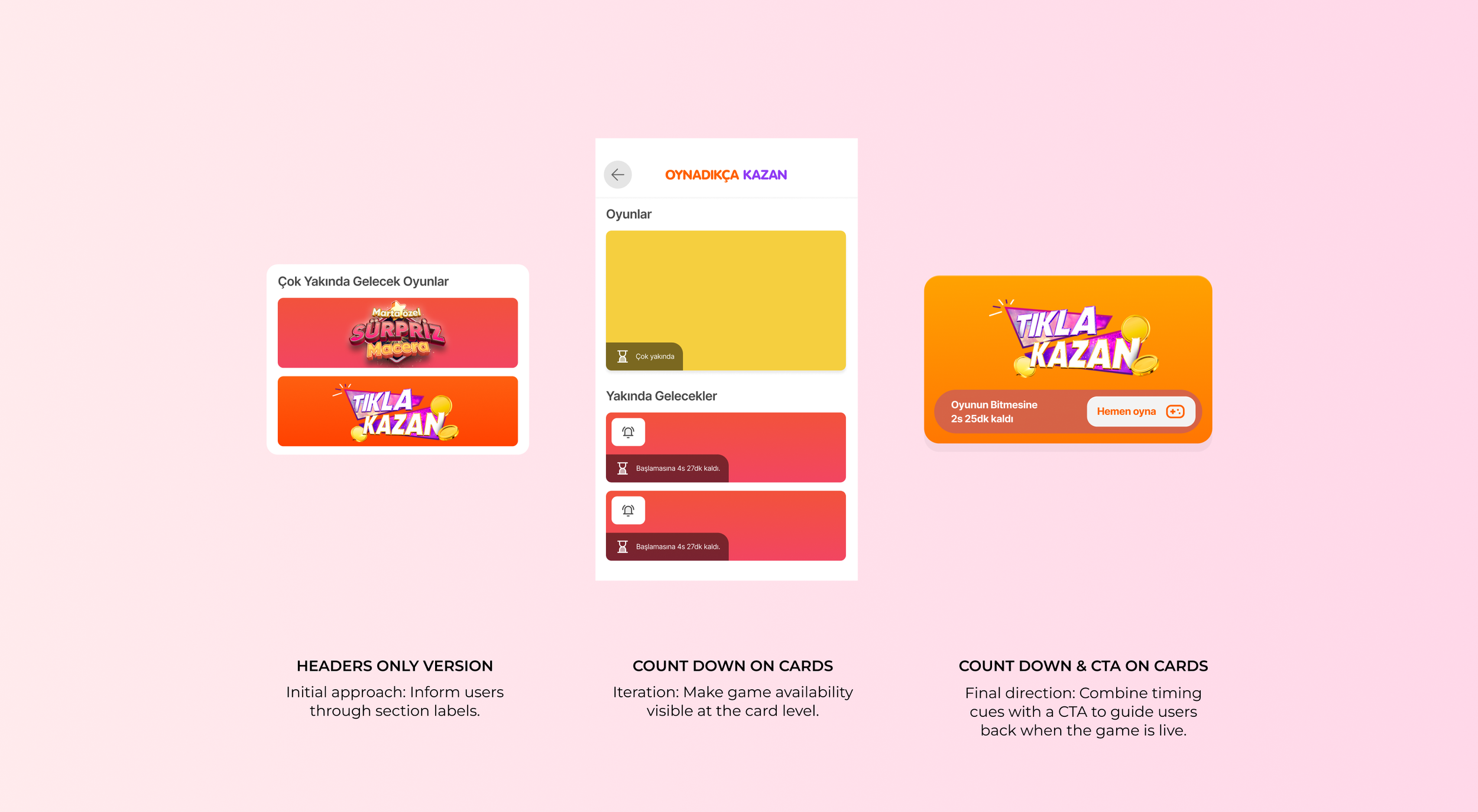
4. Coming-Soon / Reminder States
Insight: Periodic games created confusion when availability was unclear.
Decision: Add countdowns and reminder states to help users return at the right moment.
We learned that “coming soon” information worked best when it was attached directly to game cards, supported by countdowns, and paired with a clear next action.
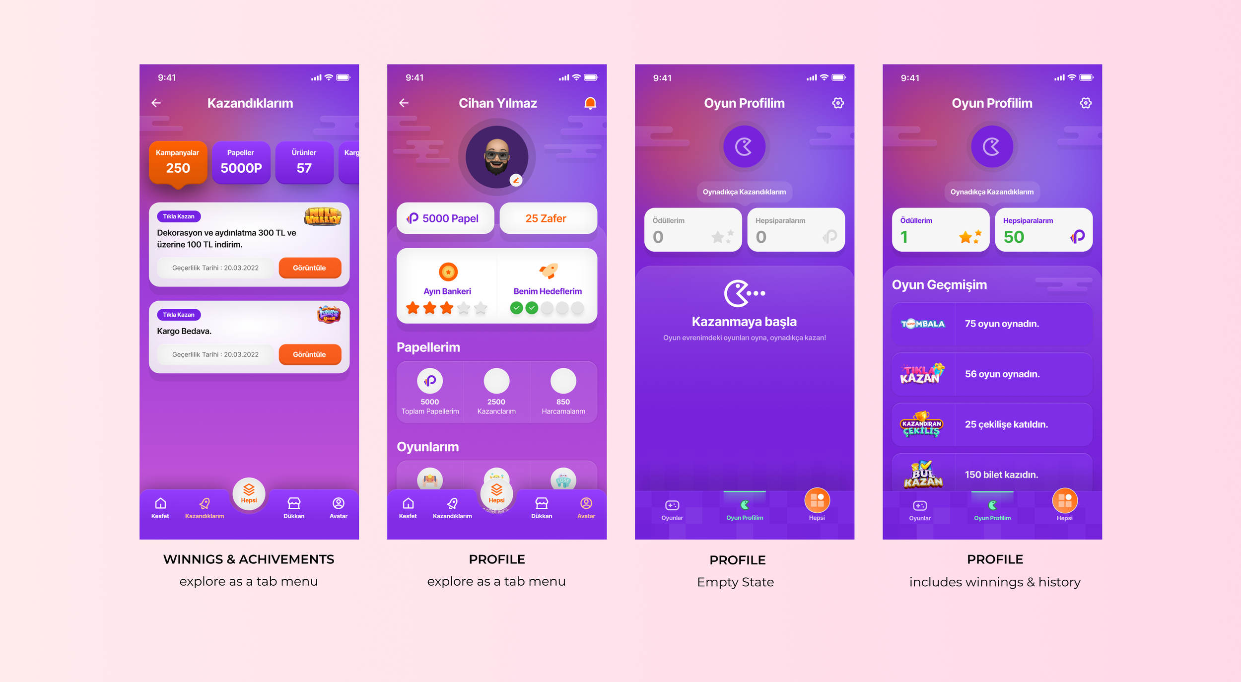
Insight: Users cared about tracking achievements, rewards, and performance.
Decision: Introduce profile, winnings, history, and reward surfaces to complete the play-win-return loop.
Final Solution — Building a Scalable Game Hub
The final Game Hub experience connected discoverability, entertainment, rewards, and shopping redirection into a scalable vertical inside the Hepsiburada app. Instead of treating games as temporary campaigns, we designed a destination users could revisit, understand, and benefit from over time.
1. Easy Access
We introduced more reliable access points from the homepage and super-app navigation, reducing dependency on temporary placements and notifications.
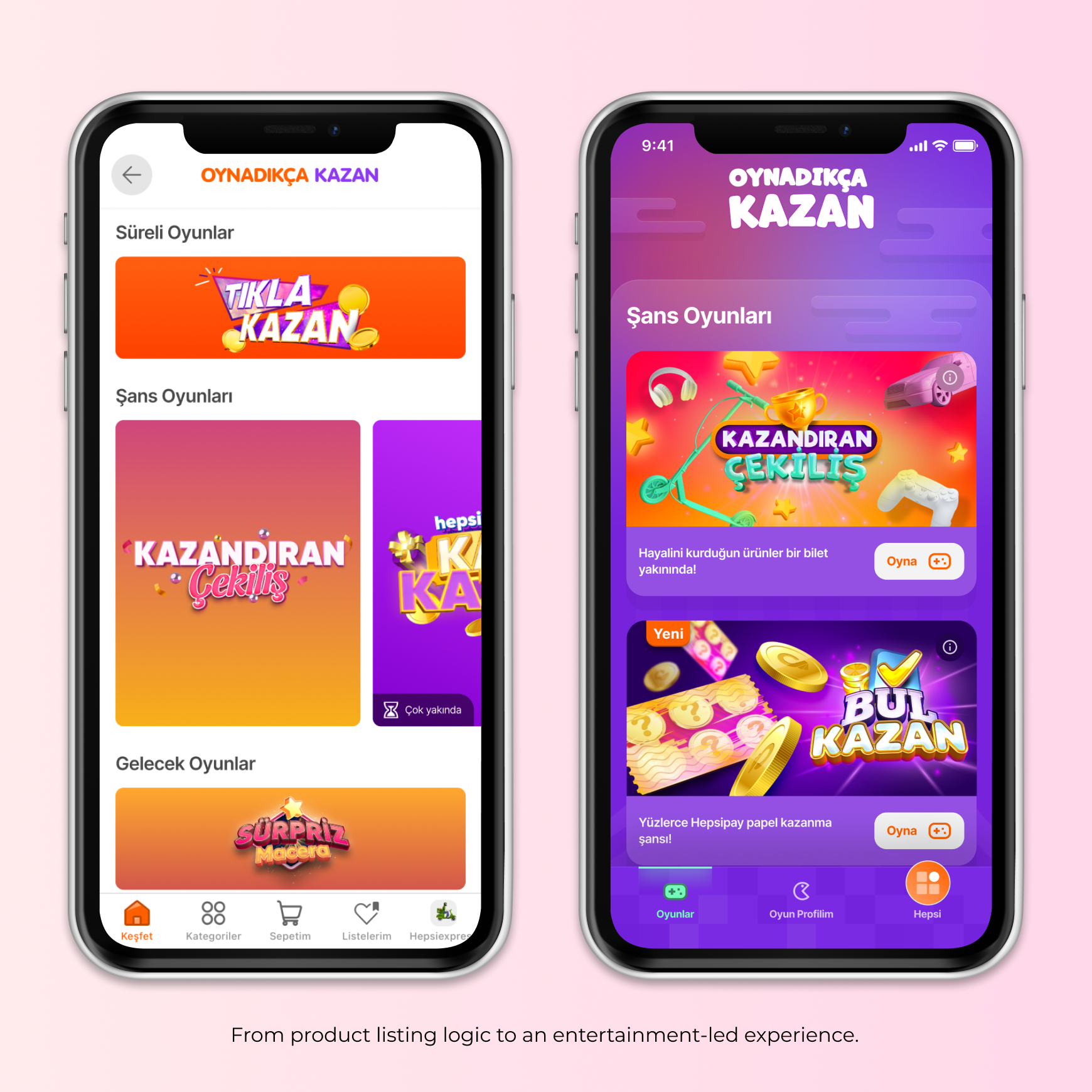
2. Branded Game World
We evolved the Game Hub from a simple listing page into a colorful, branded experience that made the game vertical feel distinct from regular shopping flows.
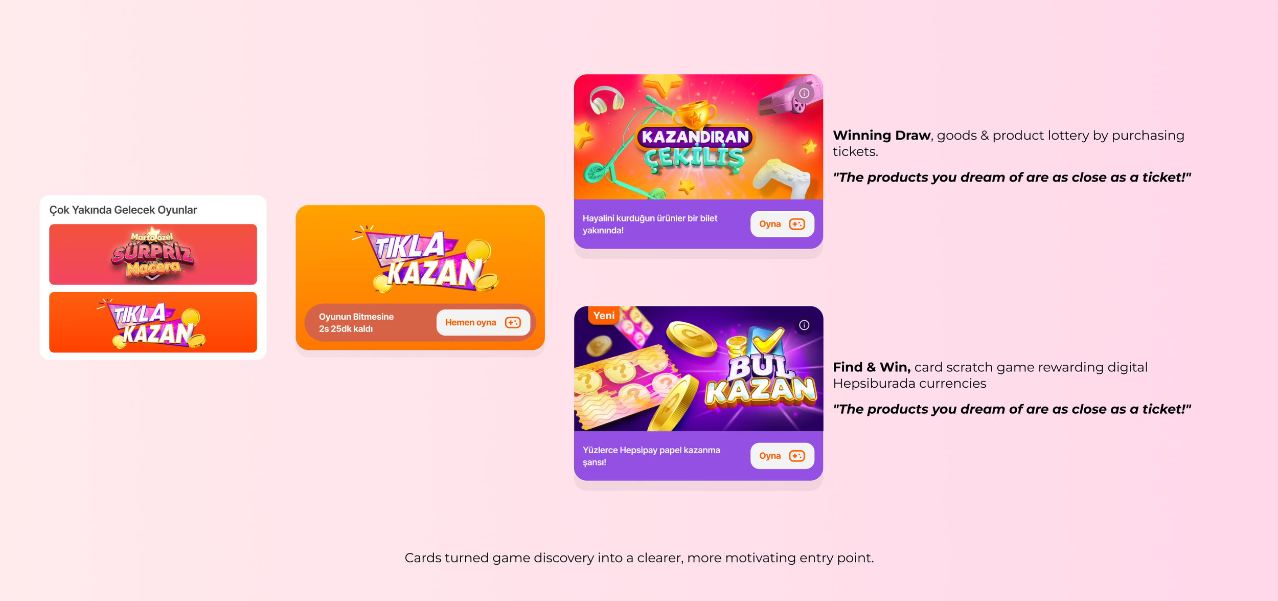
3. Game Card System
Game cards became the main storytelling unit, helping users quickly understand the game theme, reward, timing, and next action.
What changed
Game-specific visuals made each game easier to recognize.
Reward-led messaging clarified the value of participation.
Teaser lines created curiosity and explained the game concept.
CTA and timing states helped users know when and how to act.
4.Completing the Cycle — From Play to Shopping
To complete the play–win–shop cycle, we connected game history, rewards, and shopping redirection. Users could track what they earned, access rewards before they expired, and move directly to relevant shopping pages to use their benefits.
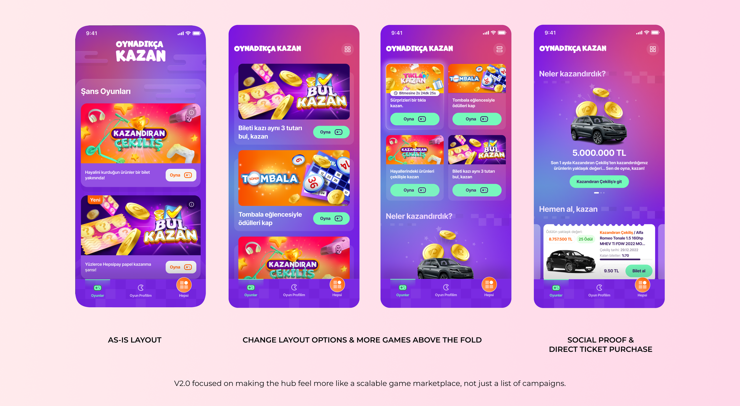
6.Game Hub V2.0 — Scaling the Experience
As the number of games increased, the original layout started to lose visibility above the fold. In V2.0, we explored a more scalable layout that surfaced more games earlier, highlighted live games, added social proof, and enabled direct ticket purchase from the hub without entering the game detail flow.
5. Directing Web Users — Turning Web Traffic into Mobile Engagement
Since not all games were available on web, we designed a landing page to introduce the Game Hub experience to web users and guide them toward the mobile app. The page explained what users could win, highlighted available games, and used QR codes to create a clear bridge from web discovery to mobile participation.
Impact — From Game Discovery to Business Growth
Game Hub became a measurable growth lever for both engagement and commerce. By centralizing access, improving game discovery, and connecting rewards back to shopping actions, the experience increased traffic, game views, order direction, and conversion across different game types.
1. Engagement Growth
+138%
Average monthly visitor increase - Last six months of 2022
+312%
Increase in Game Hub view numbers - Compared first six months to last six months
2. Commerce Contribution
30%
Of total orders from Game Hub - Last two months of 2022
+62%
Increase in orders directed from Game Hub - Compared first six months to last six months
3. Conversion Performance
23.5%
Average CR in commercial games
5.6%
Average CR in growth games