

Gamifying E-shopping, Mission System
Problem & Vision
Hepsiburada saw an opportunity to expand gamification beyond Game Hub and turn it into a broader growth lever across the shopping experience. We designed the Mission System to help users complete tasks, track progress, and earn rewards — creating a more engaging shopping journey while supporting traffic, order growth, and Premium acquisition.
My Leadership & Role
As the design lead, I led concept development, ideation, design reviews, and usability validation, while contributing to stakeholder alignment and product strategy. The launch reached 502,620 targeted users, generated 125,877 mission starts, and drove 122,418 new orders.
Team Structure
2 Product Designers, 2 User Researchers, 1 UX Writer
Date
Jun 2022 - Sep 2023
My Approach
I approached the Mission System as a scalable engagement model, not just a gamified feature. My goal was to connect user motivation with Hepsiburada’s broader growth objectives through a system that could drive discovery, repeat actions, and reward-based participation across the app.
1. Framing the Opportunity
The opportunity emerged as Game Hub traffic and loyal user activity increased, signaling that gamification could create value beyond a single destination. Instead of treating missions as a one-off campaign mechanic, I framed the system as a broader product lever that could support traffic, order growth, and Premium acquisition across the shopping journey.
Keywords: Growth, loyalty, scalable system
3. Strategy Decisions
I focused on turning insights into a system that could support both user value and business goals. That meant narrowing the pilot audience, aligning mission types with company priorities, defining meaningful rewards such as Premium and coupons, and designing a reusable widget-based structure that could scale across touchpoints over time.
Keywords: Audience focus, reward logic, scalability
Design Iterations
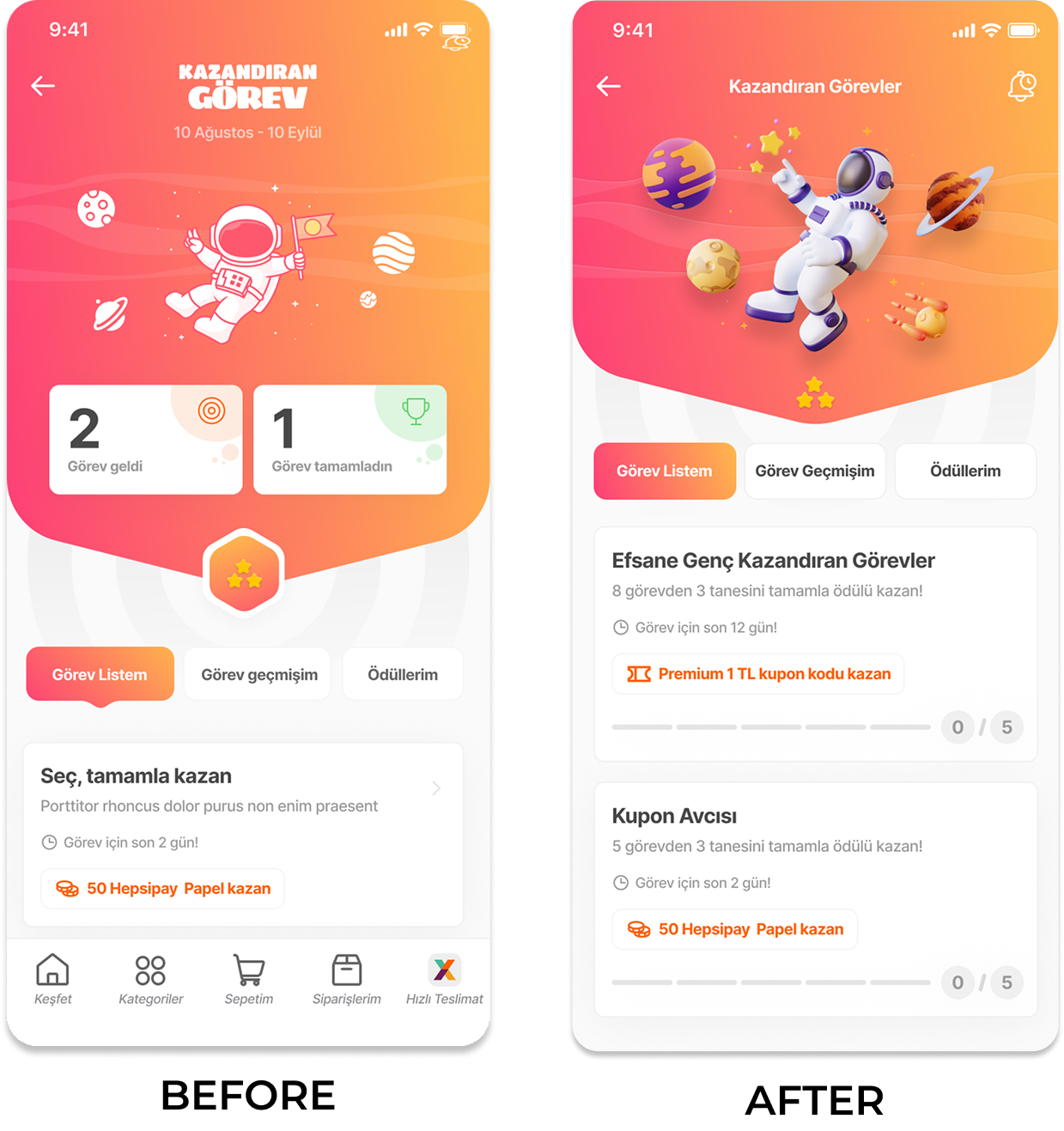
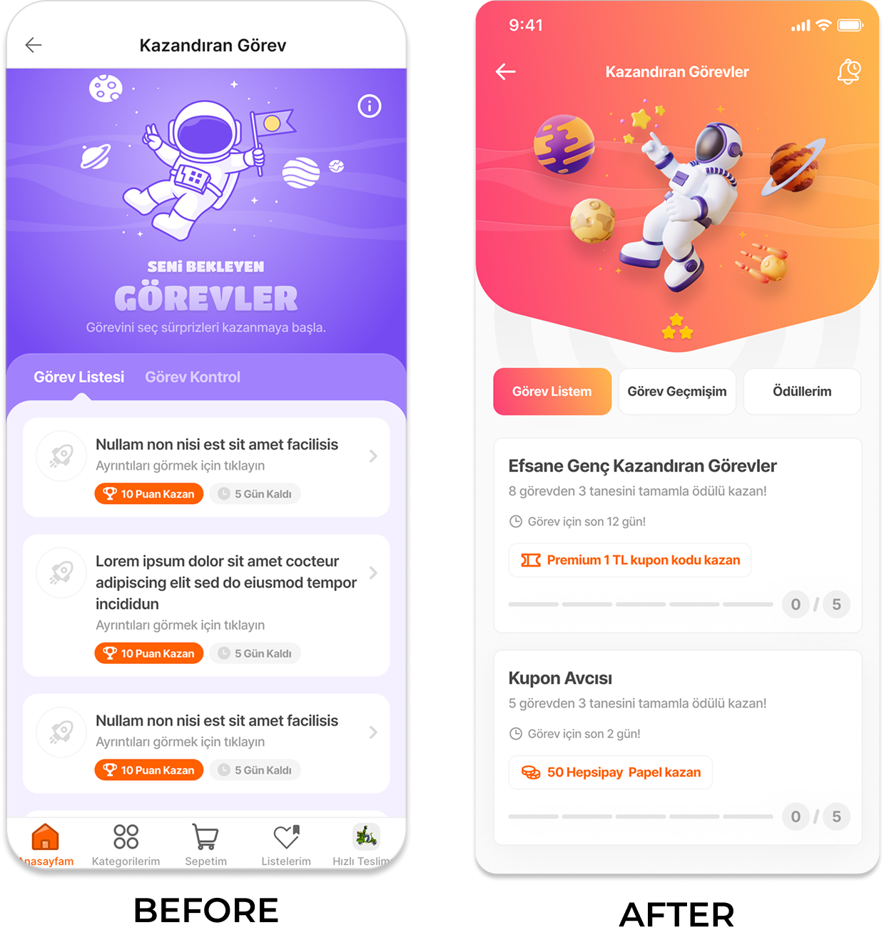
How research insights translated into product decisions and UI changes.
2. Research & Inputs
To shape the direction, we combined three inputs: gamification literature, competitor analysis, and user testing. This gave us a balanced view of what motivates users in theory, how similar systems structure rewards and progress in the market, and where real users experience friction, confusion, or low motivation in practice.
Keywords: Theory, market, user insight
4. Experience Principles
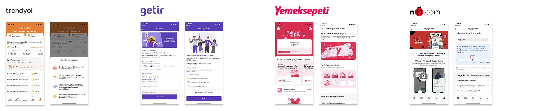
Competitive Patterns We Learned From
We reviewed adjacent e-commerce and delivery products to understand how they structured rewards, progress, effort, and clarity. This helped us identify what felt motivating, what felt restrictive, and what users might struggle to understand at a glance.
What this meant for us
Rewards should feel meaningful
Participation should stay flexible
The experience was shaped around a few clear principles: make progress visible, reduce friction to participate, keep reward value explicit, and support voluntary participation. To make the system feel achievable, we allowed users to complete only part of the mission, used clear progress indicators, and designed multiple entry points to guide users into the flow naturally.
Keywords: Clarity, motivation, flexibility
The most effective systems balanced clear rewards, achievable effort, and simple mechanics, while weaker ones created friction through high effort, restrictive participation, or unclear progress.
Effort should stay reasonable
Progress and rules should be clear
Strategy Framework
To turn insight into action, I defined the Mission System as a structured engagement model that connects user motivation with business goals. The system was built around a focused audience, action-driven missions, visible progress, and rewards designed to encourage repeat participation across the shopping journey.
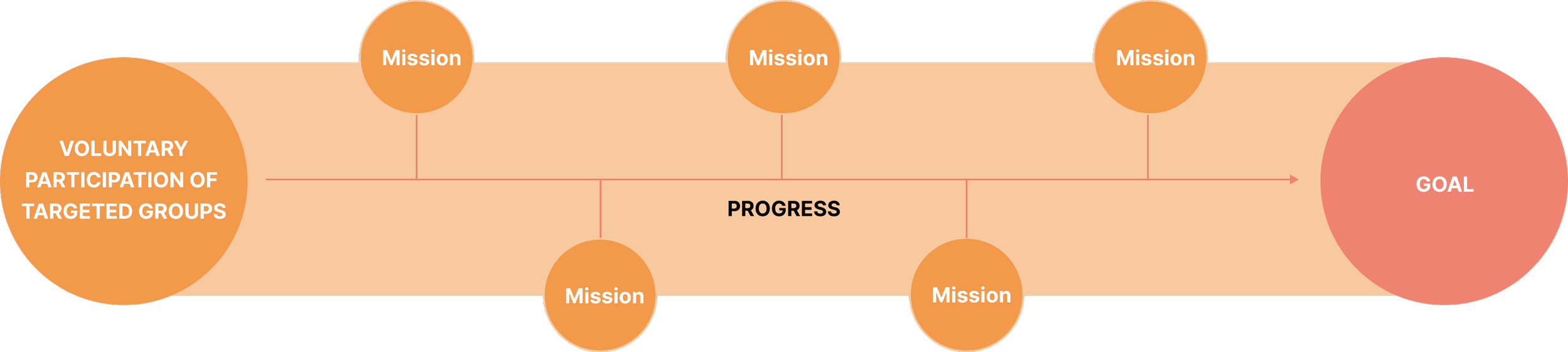
The system was designed as a modular structure where users voluntarily engage with missions, track progress over time, and move towards a clear goal through repeatable actions.
What we defined
Target audience: younger, non-Premium, and game-engaged users
Mission types: actions linked to discovery, engagement, and order-driving behavior
Reward model: Premium benefits and coupons
System logic: visible progress, achievable participation, and scalable touchpoint
System Design Principles
Start with a focused audience
Use progress to drive participation
Tie actions to business goals
Use rewards to create momentum
Structural Design
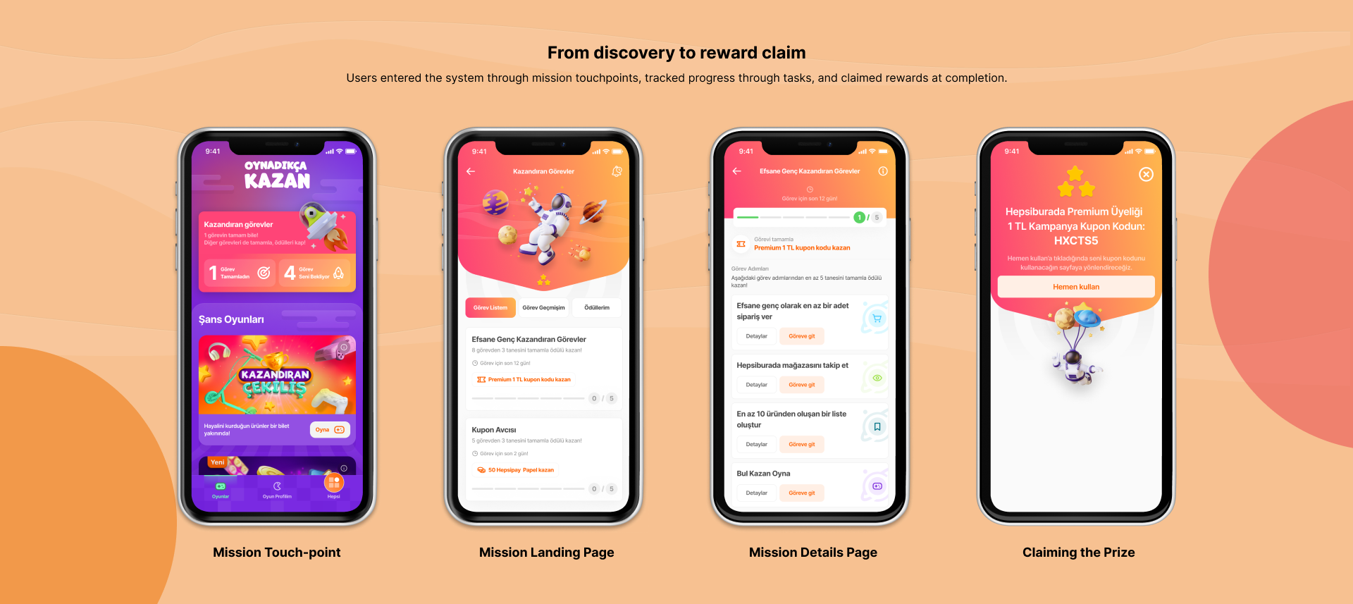
I structured the Mission System as a connected flow that guides users from discovery to task completion and reward claiming across multiple touchpoints.
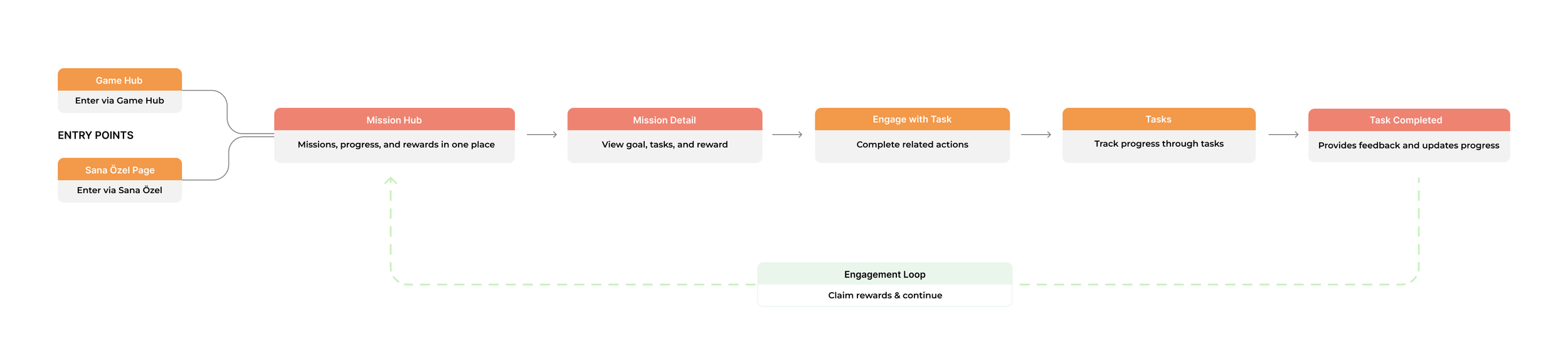
The system connects multiple entry points, a centralized hub, task-level actions, and reward claiming into a continuous engagement loop.
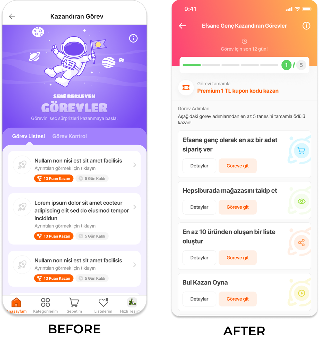
Iteration 1 — Task Effort
Problem
Users preferred simple, low-effort tasks and dropped off when tasks required too much effort.
Change
We broke missions into smaller subtasks and allowed partial completion instead of requiring all steps.
Impact
Reduced perceived effort and increased task completion.
Iteration 2— Improving Clarity
Problem
Users struggled to understand how much progress they had made.
Change
We introduced clear progress indicators and real-time feedback after each step.
Impact
Improved clarity and increased motivation to continue.
Iteration 3— Increasing Motivation
Problem
Rewards were not visible or compelling enough to drive completion.
Change
We made rewards explicit across the flow, especially on mission detail and completion states.
Impact
Increased perceived value and repeat engagement.
Final Solution
A modular mission system designed to drive repeat engagement through clear goals, visible progress, and meaningful rewards.
Entry Points
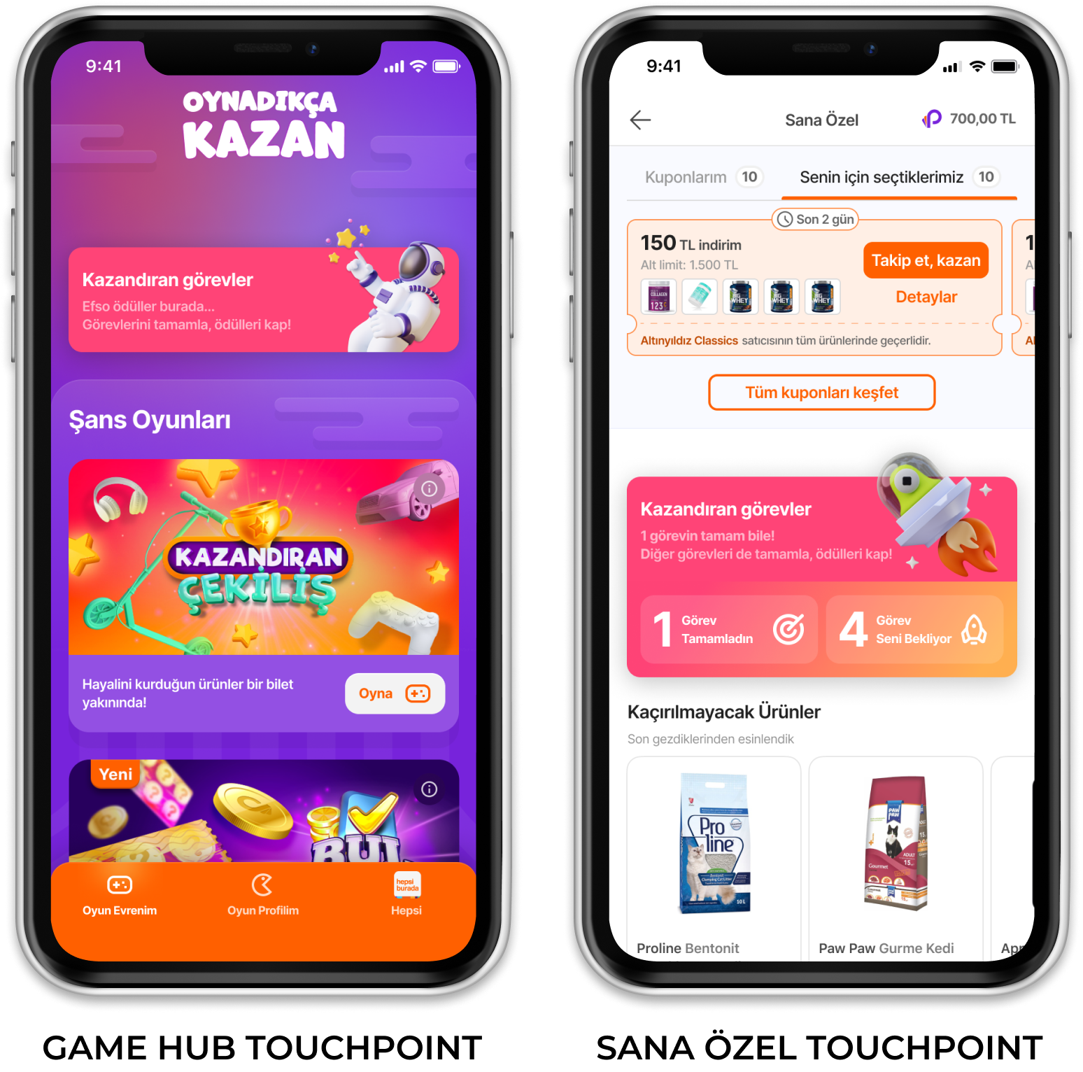
A lightweight, plug-and-play widget enables users to discover missions across key touchpoints like Game Hub and Sana Özel.
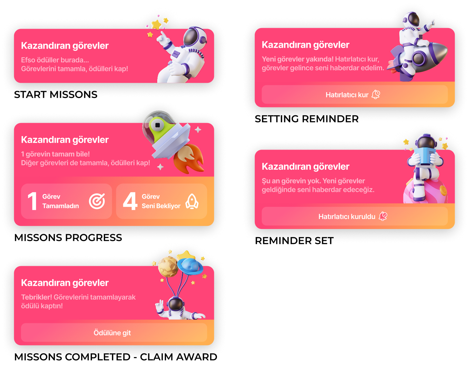
Mission Hub — System Overview
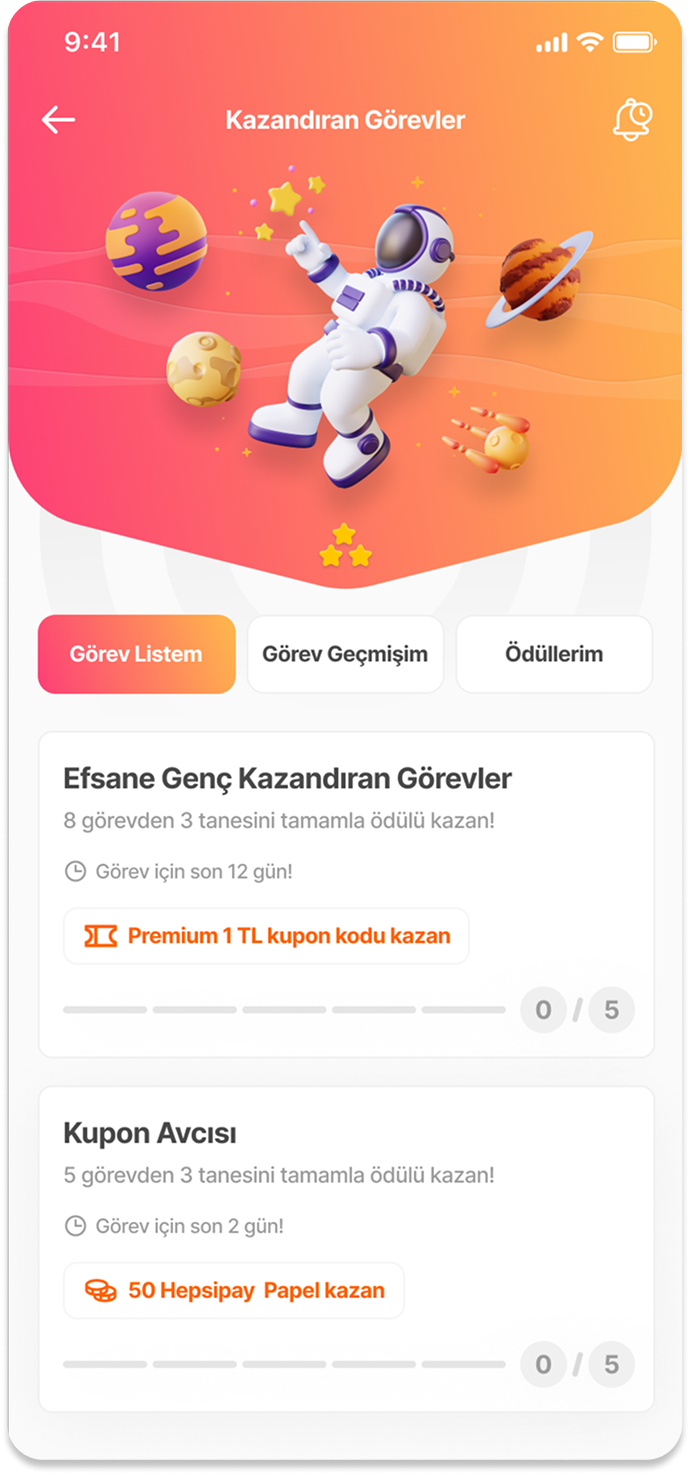
A centralized hub that brings missions, progress, and rewards together, enabling users to quickly understand what to do and what they will earn.
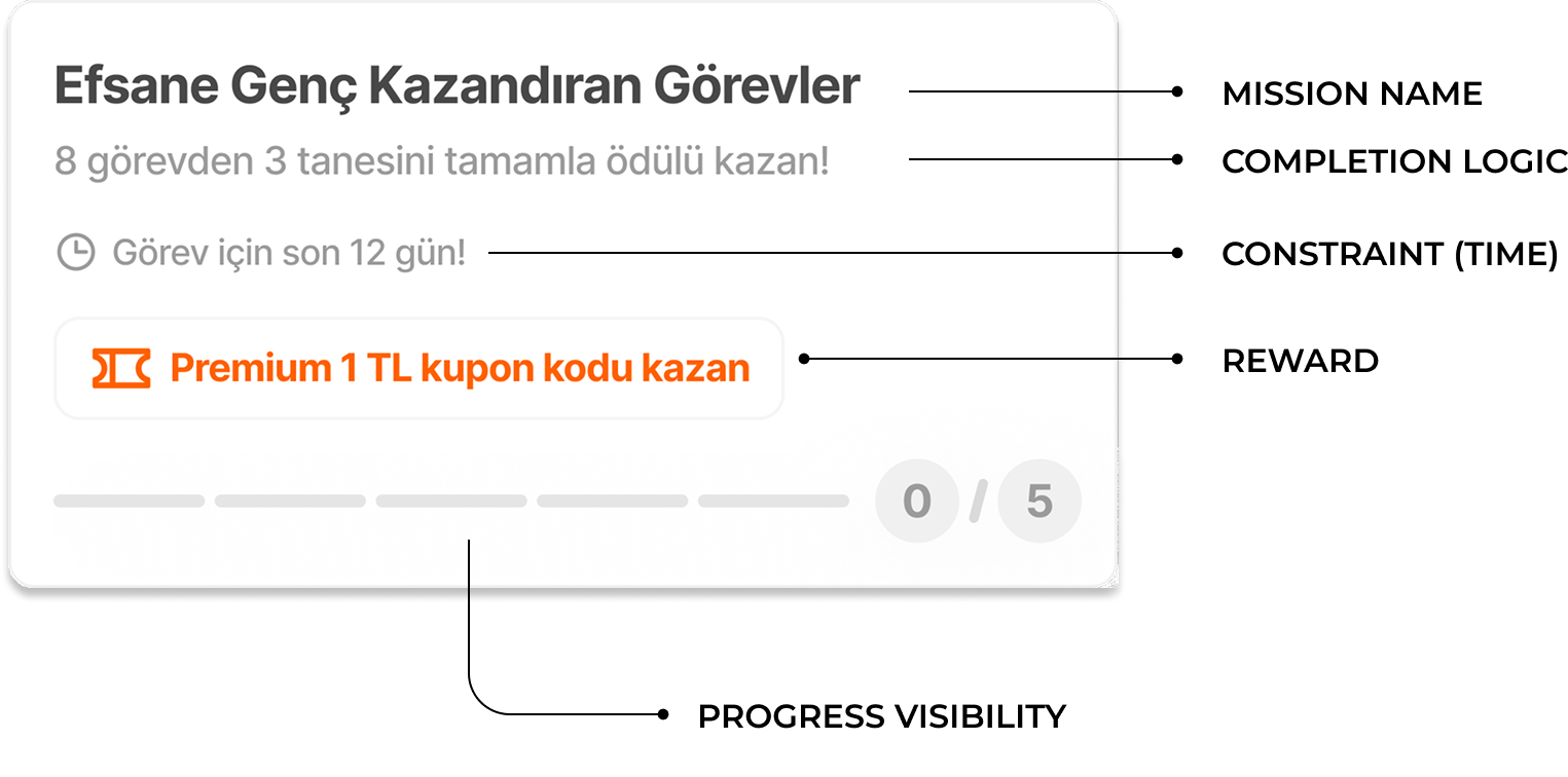
Mission Card Anatomy
Each mission is designed to clearly communicate what to do, what to earn, and how close the user is to completion.
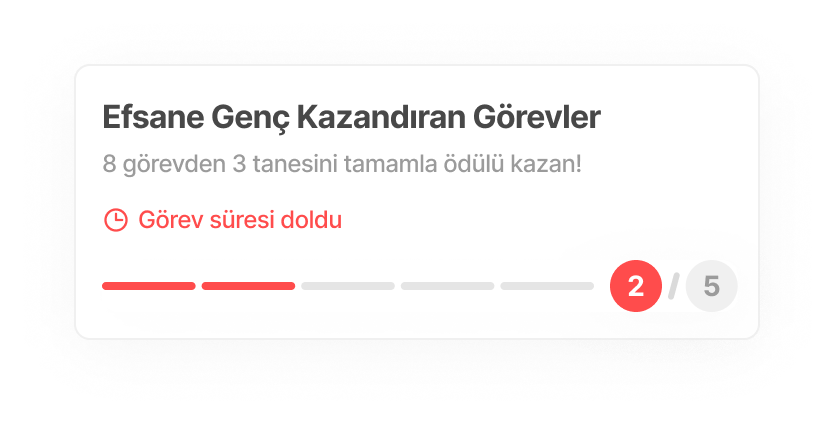
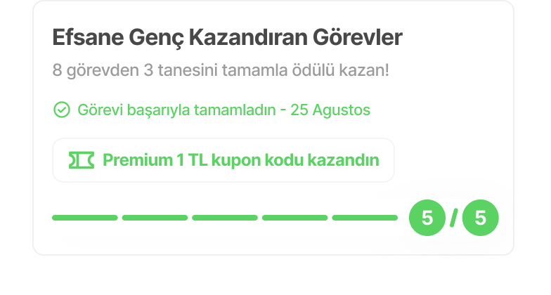
Clear goal
Users are informed when a mission expires, with clear feedback on partial progress.
Upon completion, users receive clear confirmation and reward feedback, reinforcing motivation.
This structure makes the system scannable: users can quickly understand the goal, effort required, and reward without needing to explore deeper.
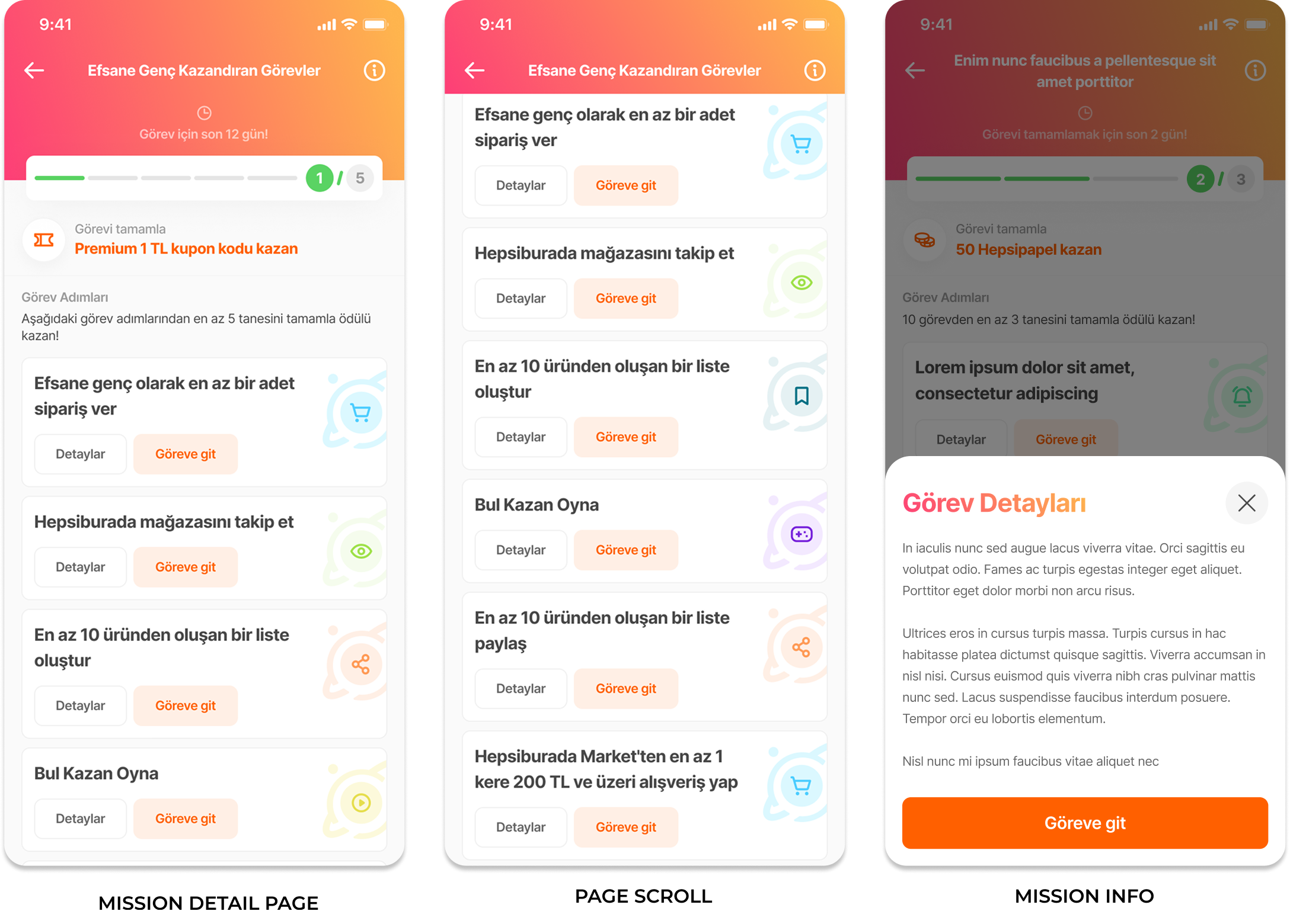
Mission Detail — Core Experience
Users can clearly understand what to do, how far they’ve progressed, and what they will earn, all within a single, focused view
Visible progress
Actionable tasks
The system balances clarity and flexibility by allowing users to complete only part of the mission while still making meaningful progress.
This structure reduces cognitive load and helps users focus on completing tasks without confusion.
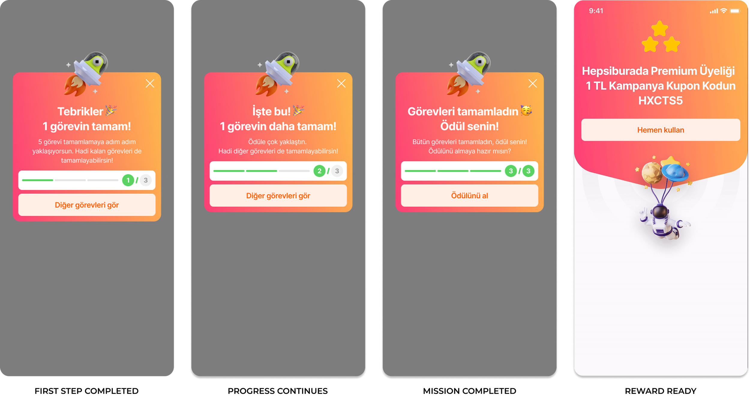
Reward & Feedback Loop
The system reinforces user motivation by providing immediate feedback during progress and a clear reward state upon completion.
Immediate feedback
Visible progress
Reward clarity
Progress Feedback
Reinforcing Progress at Every Step: Each completed step confirms progress and guides users toward the final reward.
Impact — From Discovery to Conversion
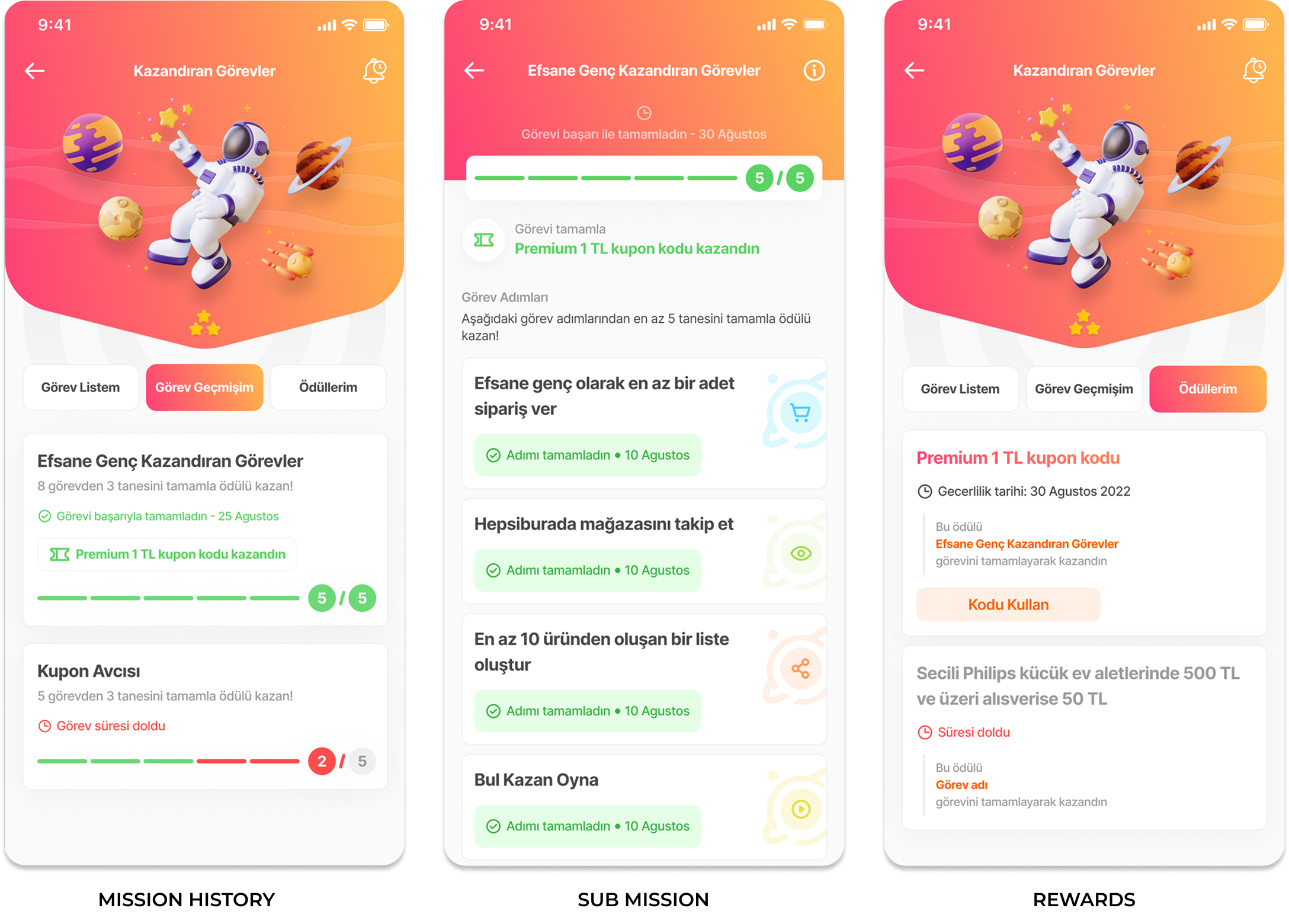
Clear feedback turns mission completion into a repeatable cycle of progress, reward, and re-engagement.
*Duration 17 JAN - 28 FEB
We reached over 500K users, converting 25% into mission engagement and 10% into completion, validating missions as a scalable lever for both user activation and repeat engagement.
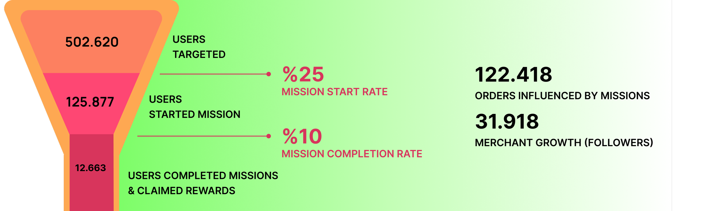
Strong drop-off between start and completion highlights the impact of task effort and reward clarity on user commitment.
Missions transformed passive users into active participants, driving measurable impact across conversion, engagement, and merchant value.